What are the hottest topics in Chinese AI research? It's a simple question to ask––less simple to answer. You could start by Googling around, looking at recent news coverage, or browsing an academic database. Maybe you're lucky enough to know a subject matter expert who can steer you in the right direction. Still, it's hard to know if any of these approaches will give you much to go on (much less the full picture), or how you'll know if you picked the right place to start. And who has the time for open-ended research in the first place?
Enter the Map of Science.
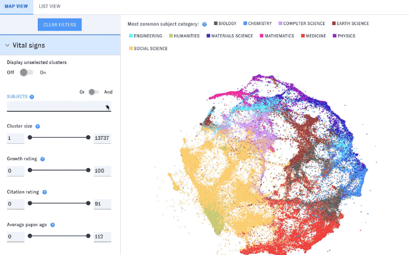
The Map of Science collects and organizes the world’s research literature, revealing key trends, hotspots, and concepts in global science and technology. Building on cutting-edge work by CSET’s data team, the Map makes it easy to pinpoint important technological trends, as well as the countries, authors, institutions, and funders driving progress. The Map is powered by our Merged Academic Corpus, which contains detailed information on over 270 million scholarly articles from around the world.
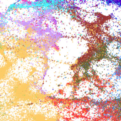
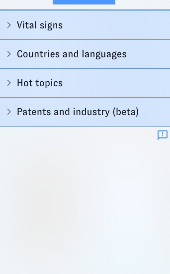
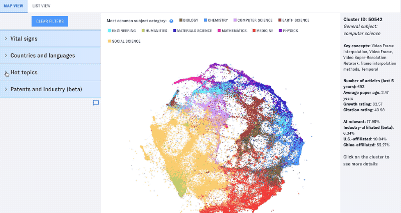
In this post, we’ll show how the Map can help with that Chinese AI question. We’ll start by opening sciencemap.eto.tech to its main view, showing a visual mapping of the global literature alongside a filter pane. Each dot on the Map is a research cluster: a group of articles that cite each other frequently. That’s typically because they share other things in common, like topics or languages (for example).
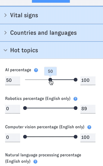
We’ll apply some filters to quickly winnow down to the relevant research only. The Map covers all topics and technologies, but it does have some special features related to AI and similar topics. Let’s raise the threshold for AI relevance, which will select only clusters with a lot of AI research articles.
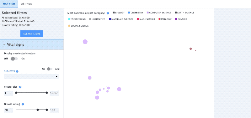
Next, filter further by Chinese author affiliation. We’ll also limit the view to groupings of research that are growing especially fast.
From hundreds of millions of articles down to a handful of clusters––not bad for a start...
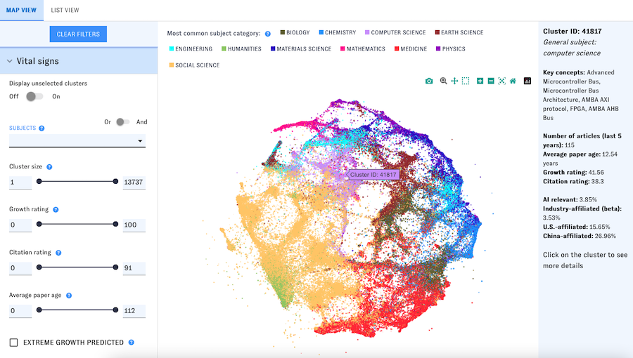
To begin figuring out what these results mean, hover over the remaining dots for quick summaries, or switch to list view to skim multiple clusters at the same time.
This summary data is the tip of the iceberg - the Map includes detailed information on the research in each cluster, including its growth rate, citations, top subject and concepts, and leading countries. You can also browse the top articles, sources, authors, institutions, and funders in the cluster, and see how its research is being used by industry.
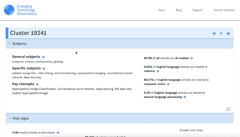
To access this information, click on any cluster that intrigues you. It looks like the research in this particular cluster is focused on hyperspectral image processing, with a large share of Chinese authors and rapid growth in the past few years. A lot of the authors work at the Chinese Academy of Sciences and a few other Chinese universities.
In just a few minutes, we’ve moved from the broad, even overwhelming question of “what’s going on in Chinese AI?” to detailed trends and indicators for further exploration. That’s the Map’s goal: to get you to the best possible “starting points” for further analysis and action.
To start using the Map of Science, visit sciencemap.eto.tech, or read the documentation for a thorough introduction to the tool and its features. In future blog posts, we’ll show off more of the Map’s capabilities and explore the unique datasets that power it.