
Attention Substack users! ETO blog posts are also available on Substack.
Historical trends in the Map of Science are useful for identifying research areas that are growing, such as filtering for clusters with high recent growth. But what about predicting future growth? With our improved extreme growth predictions, we are better able to identify clusters likely to experience extreme growth in the next three years.
Defining extreme growth
To identify potential areas of emergence in scientific research in the Map of Science, we can look at areas that are quickly growing (using growth ratings) and expected to see abnormally large - or extreme - growth in the short term (three years). We use the definition of extreme growth in the context of research clusters described in Klavans et al. (2020) and Rahkovsky et al. (2021).
A research cluster experiences extreme growth when it sees a very large growth in its share of annual articles; specifically, if it has an 8% annual increase in the share of articles from its peak year – a threshold drawn from standard portfolio analysis. Shares are normalized by year, to account for fluctuations and general trends in publication rates.
What insights can we gain?
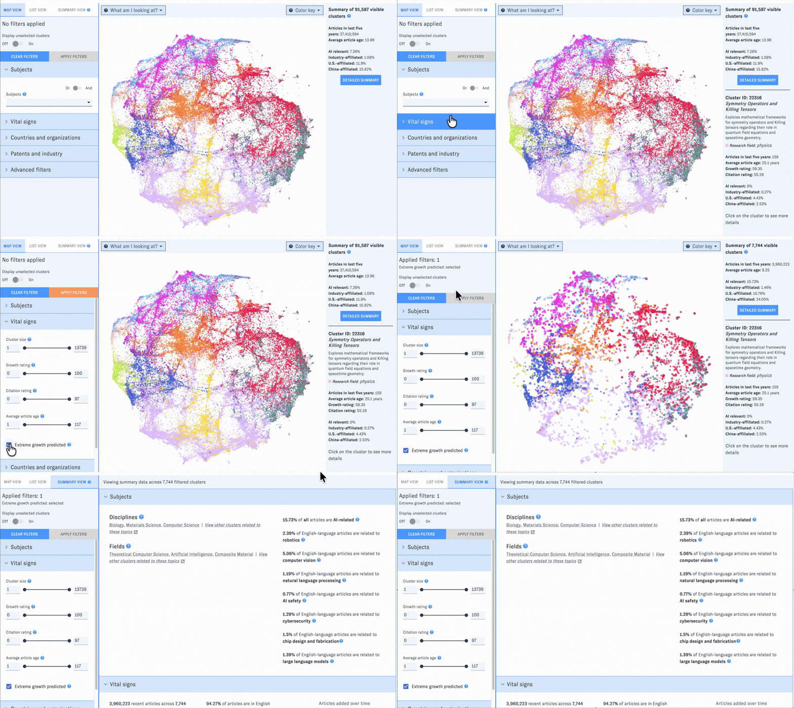
To find clusters in the Map of Science predicted to experience extreme growth, simply select the “Extreme growth predicted” option in the Vital signs filters. Across all disciplines, we see the largest areas likely to grow in the coming years in Biology, Materials Science, and Computer Science (for AI and composite materials). Two example clusters predicted to experience extreme growth, that also have more than 50% AI-relevant publications and are in the 99th percentile for recent growth, are Vision Language Models for Robotic Control and Agentic Artificial Intelligence in Space Exploration.
About the model
When the Map of Science was first deployed, we used a model of extreme growth described in Rahkovsky et al. (2021) that prioritized explainability and used a small number of cluster features. This model used a probit regression, effectively a linear model with four parameters. However, over time, it proved to only have about a 10% precision, meaning that if a cluster was flagged as likely to experience extreme growth, then it only had about a 10% chance of actually undergoing extreme growth in the subsequent three-year period.
We decided to turn to neural networks and employ a deep learning approach to this forecasting problem in order to increase our precision and overall model performance.
We identified 141 cluster features that serve as indicators of extreme growth, either alone or in conjunction. We consider features including historical trends in publication counts, document type (e.g. pre-prints, review articles), number of country collaborations, and cluster age. We then construct a fully connected linear neural network and apply a simple softmax function on the outcomes, so that the final predictions are binary (yes/no) for clusters likely to experience extreme growth.
We explored the option of optimizing the existing probit model by pruning features that are not statistically significant, iterating until only significant ones remain. That approach comes with the advantage of explanatory power, and is helpful for theoretical understandings. However, we saw huge gains in predictive power when using a simple neural network, so we decided to switch to this approach. The table below compares model evaluations on testing data.
Model training and implementation
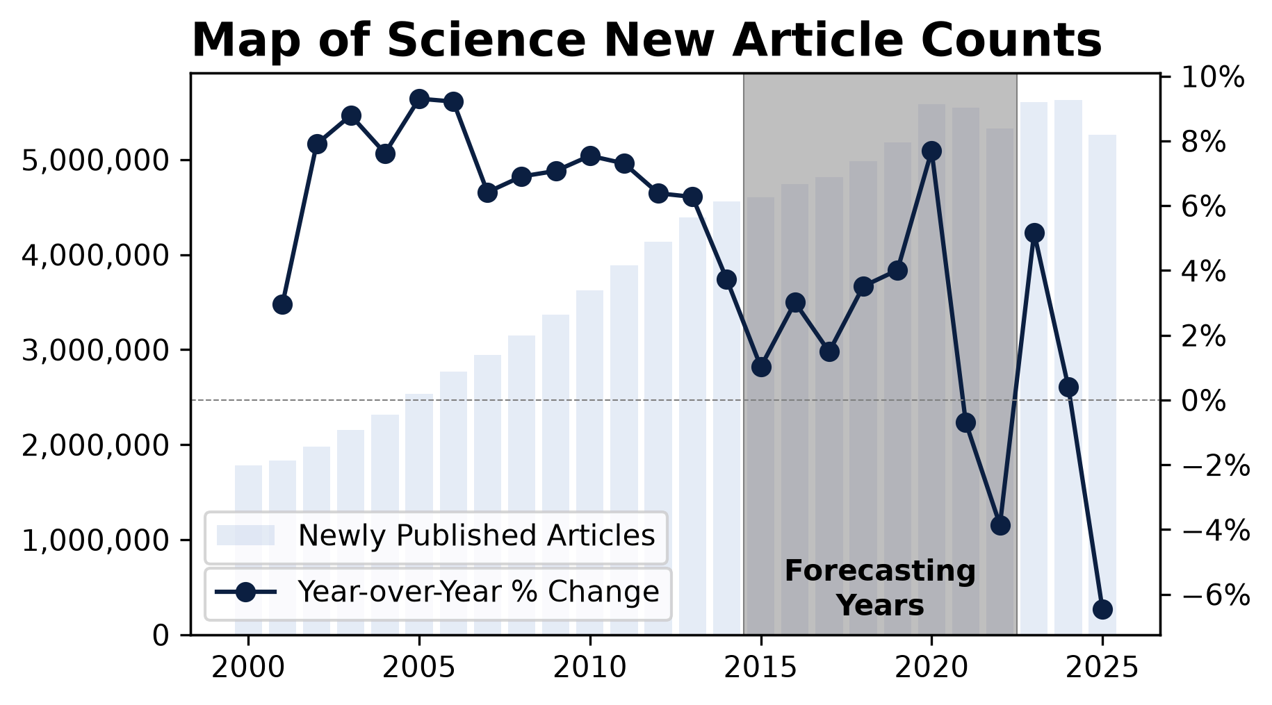
We used historical data from the Map of Science to train the classifier. We are interested in a 3-year prediction, so the earliest forecast year we can use as training data is 2022. This year is right at the tail end of the COVID-19 pandemic, which adversely affected global publishing rates, so we used a window of forecasting years to train the model that included years before the pandemic. A lot of the cluster features we’re interested in have a 15-year window, so we use 2015-2022 as forecast years for developing the model with data extending back to 2000.
Source: CSET’s Merged Academic Corpus and Map of Science
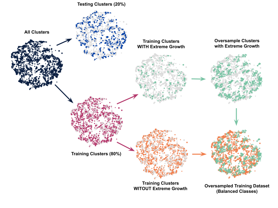
For model training evaluation purposes, we divide the data into testing and training based on clusters (i.e. 20% of clusters are used for testing purposes, with 80% used for training), as shown below. Because of the massive imbalance in clusters predicted to experience extreme growth (<9% of clusters) and clusters not predicted to experience extreme growth, we upsample the extreme growth clusters in the training set, to avoid the model optimizing itself to flag all clusters as “no extreme growth” and gaming the training evaluations (for more information on the impact of imbalanced classes, see Google’s open course on machine learning).
We want to apply the model to clusters in the most recent year (i.e. 2025), so features need to be normalized separately for each forecast year (FY) used in the dataset (i.e. 2015-2022). This is performed separately for each of the test and training sets (and with the training set, before oversampling).
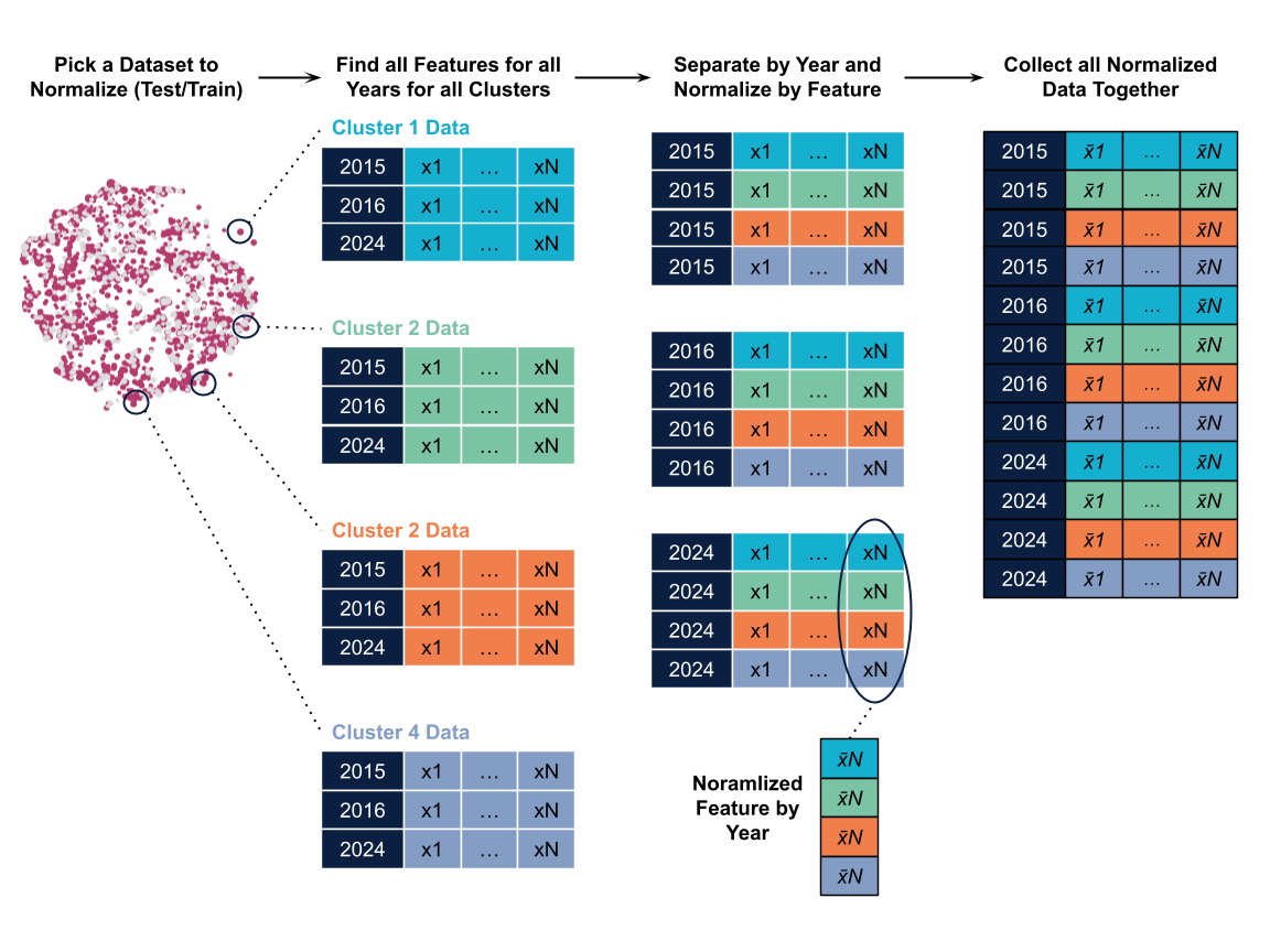
The final datasets used for training and testing purposes are moderate in size, and can be run locally. The table below shows the data counts for the training and testing purposes:
Clusters are assigned a single class from the output model, using softmax on the model outputs. The model is trained for 200 epochs; we found that additional training led to decreasing, marginal gains in accuracy.
To implement the new growth prediction model in the Map of Science, whenever the data is updated cluster features are fed into the model. However, because publishing data has a lag, we maintain a three-year window for predictions. For example, for data updated in July 2026, we use data up until the end of 2025 for predictions – which will be for 2026, 2027, and 2028.
Code for training and evaluation, as well as a full list of cluster features is available on GitHub here.
As always, we're glad to help you get the most out of the Map of Science and our other resources. Visit our support hub to contact us, book live support with an ETO staff member or access the latest documentation for our tools and data. 🤖