
🔔 Attention Substack users! ETO blog posts are also available on Substack. To read this one there, click here.
In today’s post, we’ll learn what these images mean - and how their differences show how certain well-known universities contribute to global research:
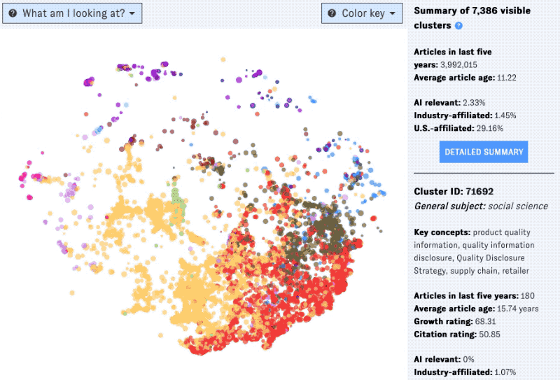
For newcomers, some context. The main (map) view in ETO’s Map of Science visualizes the global research landscape as a constellation of colorful dots, each representing a single cluster of research. Clusters spaced closer together have more inter-cluster citation links (that is, citations by articles in one cluster to articles in the other). Meanwhile, the color of each dot indicates the most common research field (for example, biology, social sciences, or medicine) among articles in the cluster from the last five years.
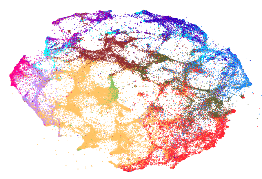
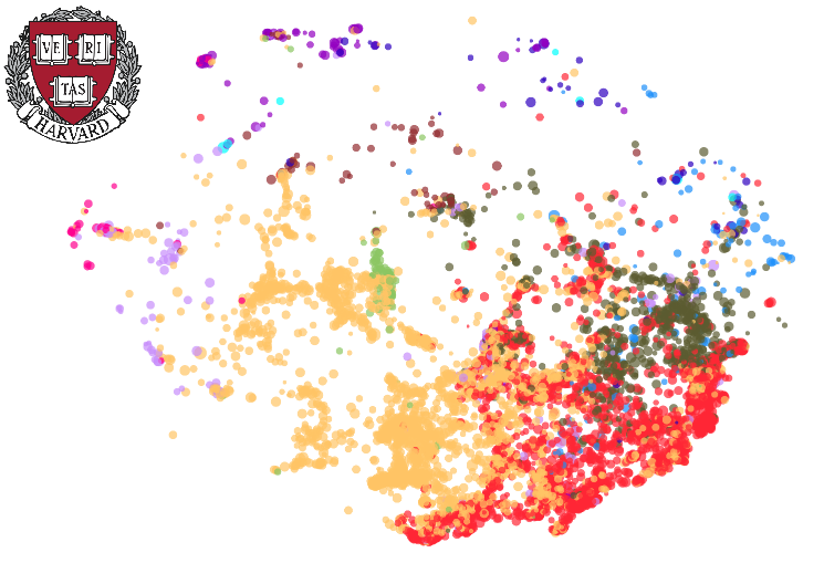
The overall Map includes over 85,000 clusters, covering hundreds of millions of articles from around the world:
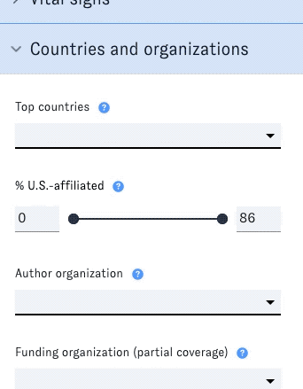
It’s a bit overwhelming all at once. Luckily, the Map’s filters let you winnow down your view by topic, growth, size, and many other research cluster characteristics.
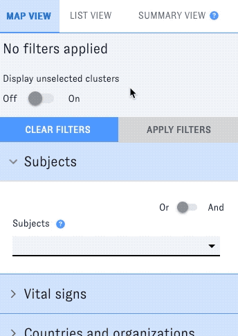
Last month, we added a new filter for research organizations. The Map of Science tracks the top authoring organizations in each specific cluster - that is, the universities, companies, and other institutions that produced the most research in the cluster. Now, you can search the entire map by these organizations, helping you pinpoint research areas where your school or company (or another one) is especially active - which is one way to understand their overall research “portfolios."
To show how this new filter works and how it can yield quick insight, let’s test the new feature out on a well-known university in Boston. (Well, near Boston.)
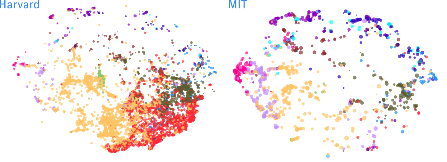
Harvard’s map is full of clusters related to medicine (red), biology (olive green), and the social sciences (yellow), with a healthy sprinkling across other subject areas.
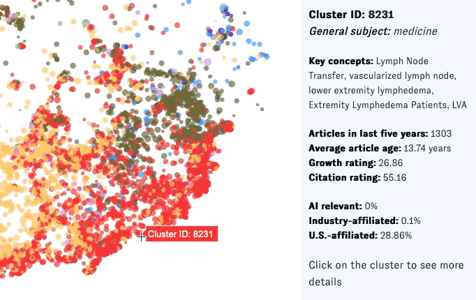
We can get a feel for what these clusters are “about" by hovering over them, which brings up details and key concepts in the right-hand sidebar:
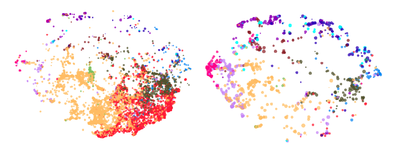
So far, so good. Let’s compare Harvard to the school down the road:
You can see the differences between MIT’s map and Harvard’s at a glance. Both universities are clearly active across a wide range of research areas, but Harvard is more prominent in clusters in biology, the social sciences, and especially medicine (MIT has no medical school). Meanwhile, MIT tends to lead more around the “edges" of the map, in domains such as math, computer science, physics, and materials science.
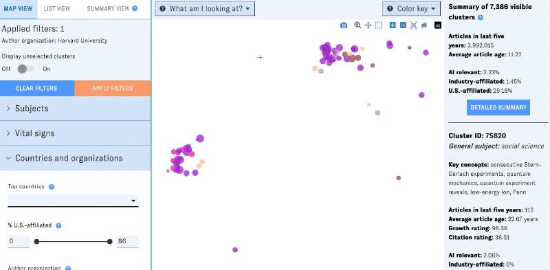
You can zoom in on specific parts of the map to learn more about research areas where these universities lead. For example, Harvard’s map isn’t heavy on physics-related clusters, but interestingly, there are two groups of them toward the top left. Let’s investigate!
These groups of clusters seem to be focused on topics in quantum science and astrophysics, perhaps suggesting that Harvard has outsize impact in these areas of physics research relative to others. (Could its Center for Astrophysics be a factor?) To dig deeper, you could switch over to list view for more granular browsing - or open individual clusters’ detail pages to learn more.
Using the Map of Science, you can take a similar approach to analyze the research leadership of thousands of institutions around the world - not just household names like Harvard and MIT. In our next post, we’ll use the Map to profile some slightly less famous schools and their contributions to global science and tech. In the meantime, give the Map a try at sciencemap.eto.tech - or feel free to contact us to learn more. 🤖