Overview
What is this tool?
ETO's Map of Science collects and organizes the world’s research literature, revealing trends at the cutting edge of science and technology. The Map organizes hundreds of millions of scientific publications from around the world into nearly 92,000 clusters based on their citations and text similarity. (Learn more about research clusters.) The Map includes data about each cluster’s key subjects, authors, and publications as well as growth over time and other indicators.
What can I use it for?
You can use the Map to:
- Track scientific output, growth, and other trends across research disciplines and fields, as well as in emerging technology subjects. The Map’s filters can help you discover and analyze clusters of research about specific concepts - everything from high-entropy alloys for cryogenic applications to air quality prediction with ML models.
- Learn about key researchers, organizations, countries, publications, and concepts in different areas of research.
- Identify the research areas with the fastest growth and largest influence based on various measures of growth and impact.
- Build your own complex Map filter combinations to quickly zero in on the most relevant subjects and research organizations to you.
Get updates
What are its most important limitations?
- The Map isn’t built for finding individual publications or authors. Instead, you can look for research fields or organizations using the Map’s filters, then browse information about the publications and authors related to that research. Read more >>
- The connection between publications in a given cluster may be ambiguous. The Map’s research clusters are generated algorithmically by connecting publications based on citation links and text similarity. This means publications in a given cluster often share key attributes, such as having the same subject matter or language, but in some cases, a human subject matter expert might group publications differently. Read more >>
- The Map shows the scientific landscape at a single point in time. The Map’s research clusters come from CSET’s Research Cluster Dataset, which are real-time groupings of publications and do not capture historical change over time through branching, budding, merging, or other large conceptual changes. Instead, we provide cluster growth statistics based on the publication dates of articles in that cluster and predicted future growth, with new articles added to existing clusters as they are published.
- Cluster metadata covers the last 5-10 years, but may be incomplete for most recent years. It takes time for data sources to incorporate the latest publications and metadata. The Map reflects this lag. Read more >>
- The Map does not include unpublished research. Its data sources only include research that has been publicly released. We believe these sources cover a significant fraction of research worldwide (and the large majority of published research in English), but we have no way of knowing how much unpublished research exists, or how different it would look if unpublished research were included. More details >>
- The Map’s coverage of Chinese-language research is incomplete. Publications that are only available in China-based journals are not included in the Map’s data sources. Use caution when interpreting data from the Map related to Chinese research organizations or authors.
- Some features are missing or limited in mobile. For the full version of the Map, we recommend using a desktop browser.
For more caveats about the data used in the Map, refer to the documentation for the source datasets.
What are its sources?
The Map of Science relies on CSET’s Merged Academic Corpus and Research Cluster Dataset. Read more >>
Does it contain sensitive information, such as personally identifiable information?
No, other than the names of researchers and organizations (all taken from public documents).
What are the terms of use?
The Map of Science is subject to ETO’s general terms of use. If you use the tool in your work, please cite us. The underlying datasets are not publicly available due to licensing restrictions.
How do I cite it?
Please cite "ETO Map of Science" and include a link to the tool.
Using the Map
How do I use it?
Viewing the Map
The Map of Science tool has four different views:
-
Map view, which is the default for the desktop version. Map view isn’t available on mobile devices.
-
List view, which is the default on mobile.
-
Summary view, which summarizes displayed clusters when filters are applied.
-
Cluster detail view, which can be opened by clicking on a specific cluster in the map view or list view.
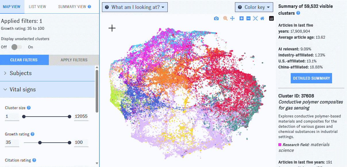
Map view
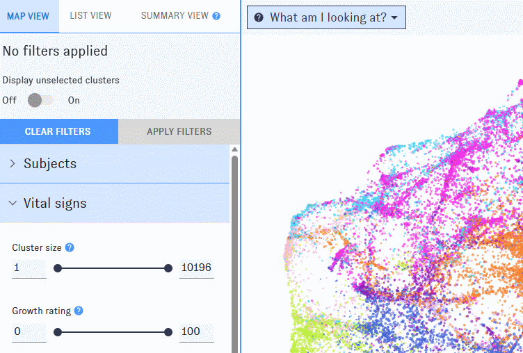
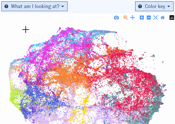
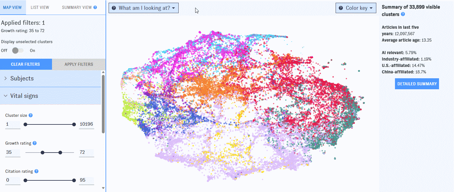
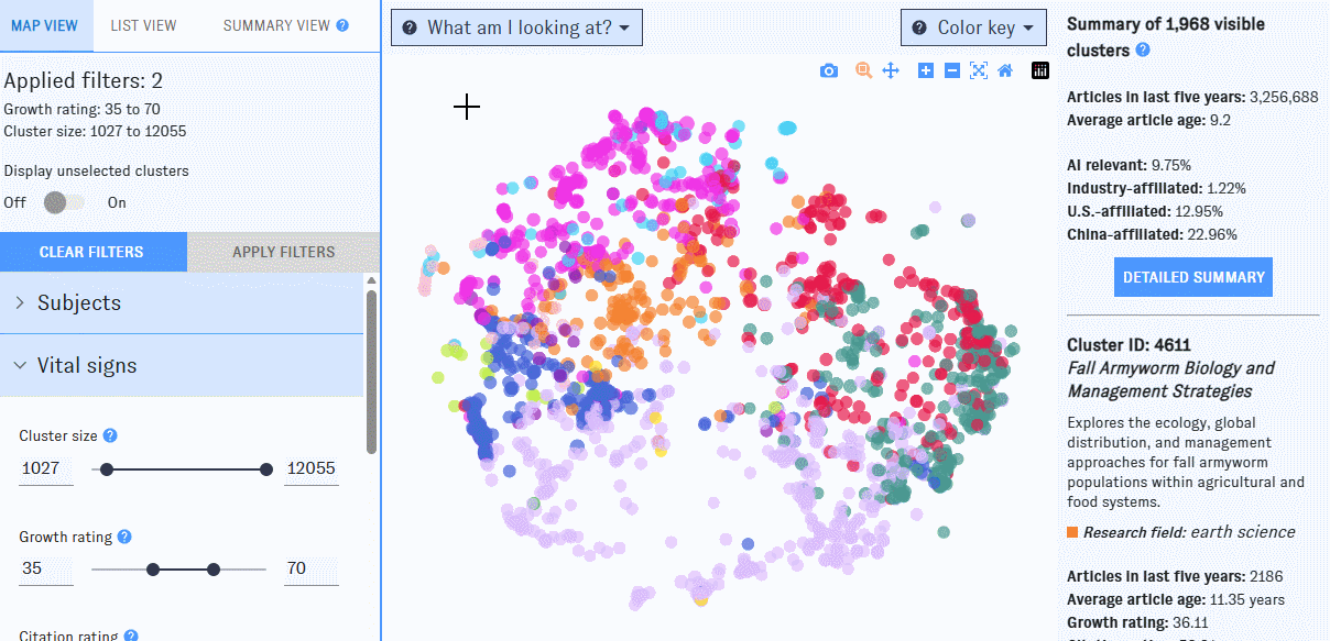
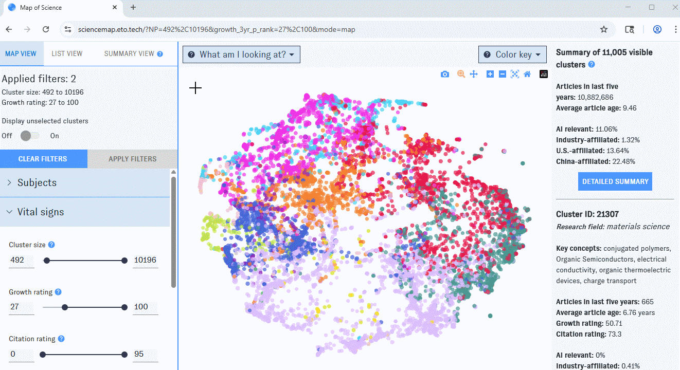
If you’re using a desktop browser, opening the Map will bring you here first. This view is built around a visualization of nearly 92,000 research clusters, each represented by a single dot on the Map. Clusters spaced closer together have more inter-cluster citation links (that is, citations in one cluster to articles in the other) and text similarity between publication titles and abstracts. The color of each dot indicates the most common research discipline (e.g. biology, social sciences, medicine) among publications in the cluster from the last five years; larger dots represent clusters with more papers added in the past five years.
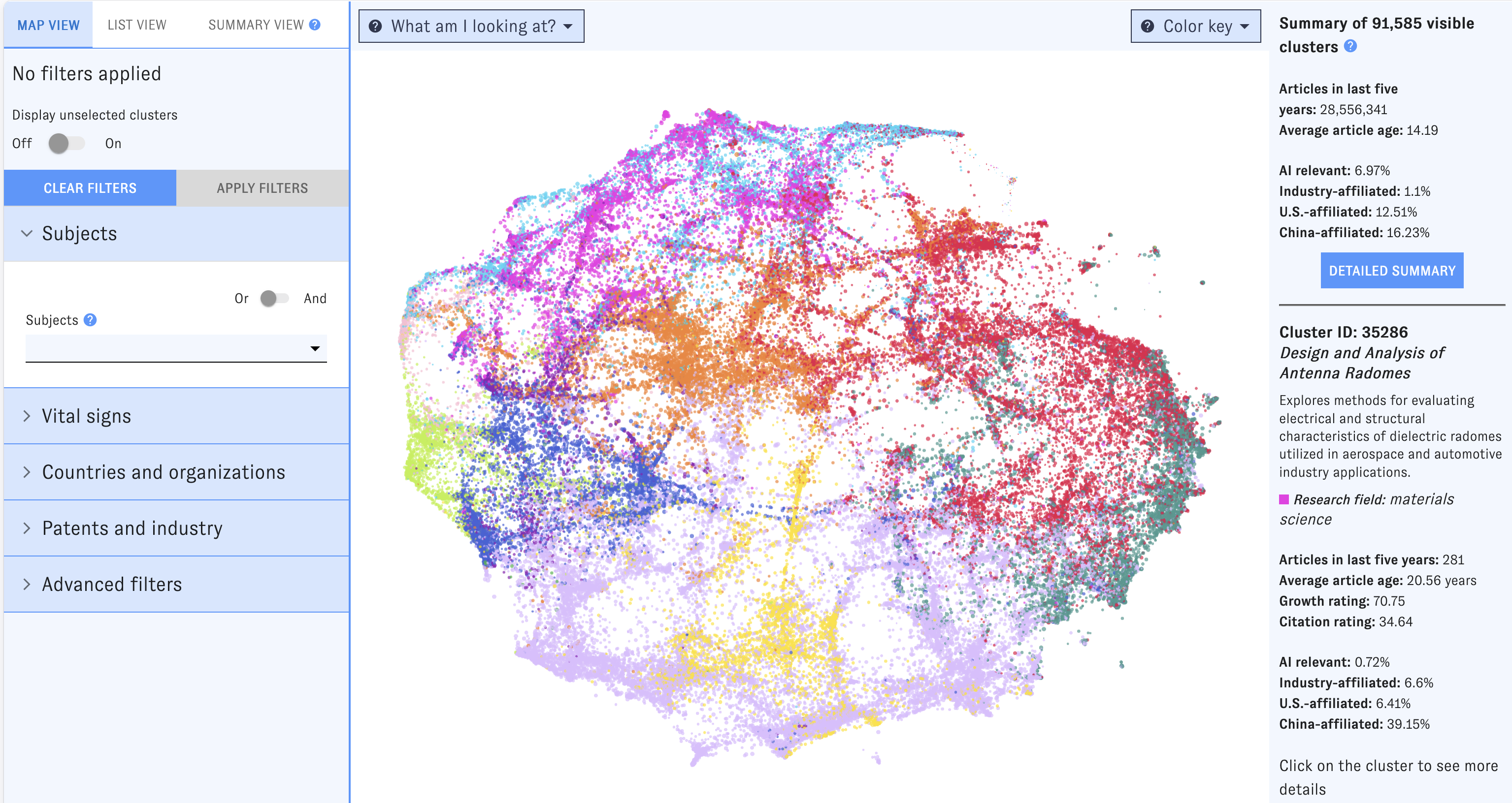
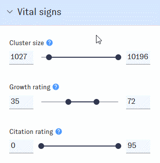
To winnow down the Map, use the left-hand filter menu. Hover over the "?" icons to learn more about what each filter means.

As you work with filters, click the "Apply filters" button to apply them. Clusters that don’t match the filters will disappear from the Map, which will automatically rescale around the ones that remain. If you’d prefer to keep all of the clusters visible, use the "Display Unselected" switch.
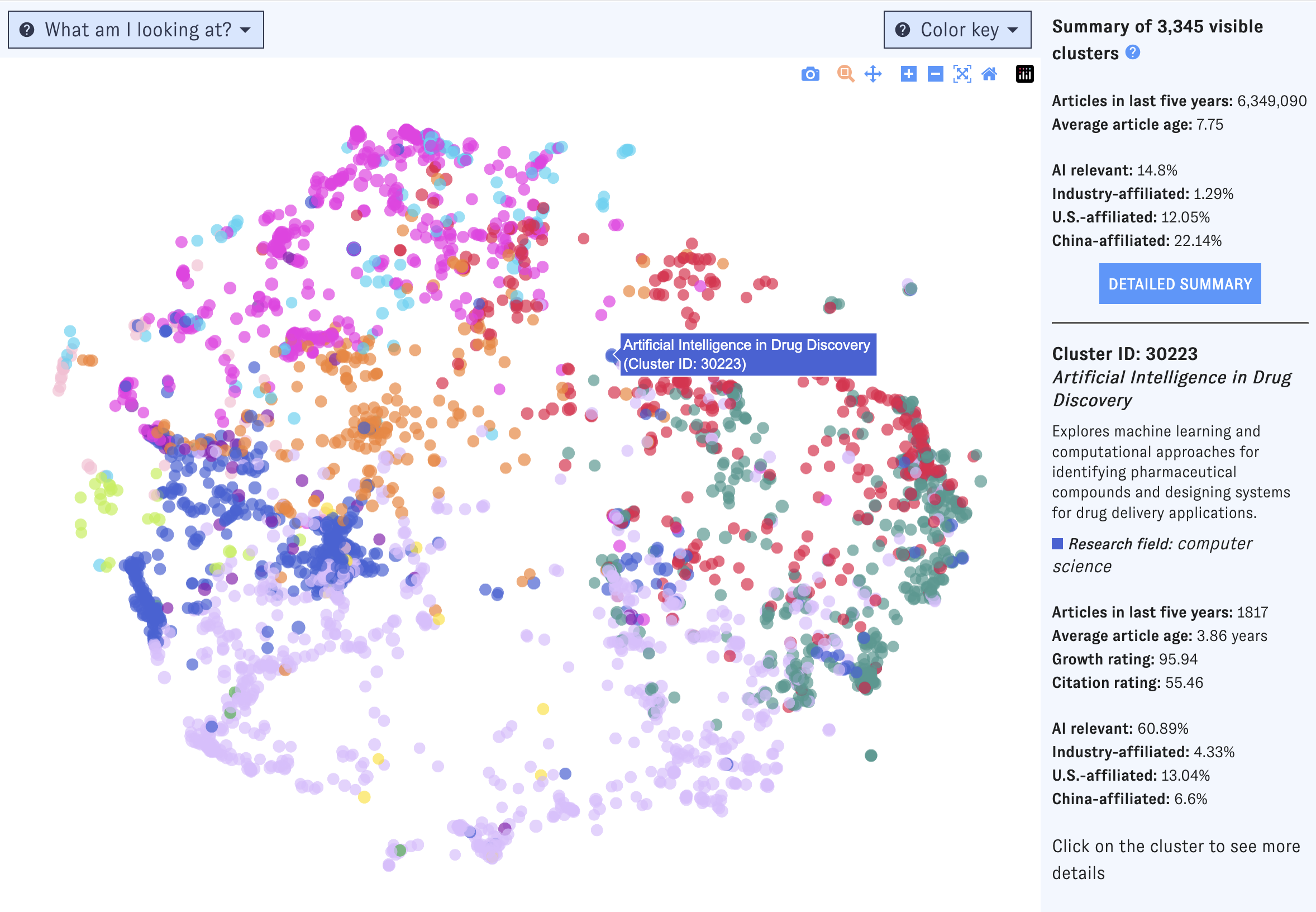
On the right side of the Map, you'll see summary information for all clusters meeting the current set of filters. If you hover over an individual cluster, summary details for that cluster will also appear in the right-hand pane. Click the "More details" button to jump to summary view, or click on an individual cluster to bring up its detail view.
Click and drag to zoom in on a portion of the Map. To access more controls, navigate to the top right corner of the window.
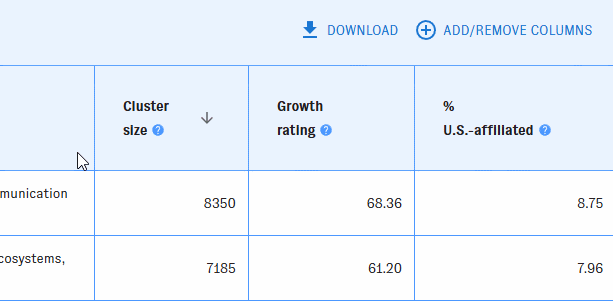
List view
The list view shows each cluster as a row in a table. Use the left-hand filter pane to narrow the table to clusters that meet your filters. To learn more about what the filters mean, hover over the "?" icons.
You can add or remove columns with the "Add/Remove Columns" button. Most of the available filters can also be displayed as columns.
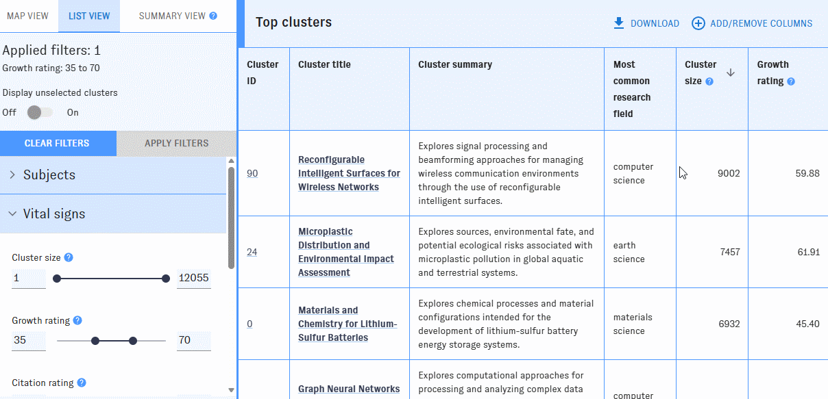
By default, the clusters are listed in descending order by cluster size. You can reorder the table by any column with an arrow icon in ascending or descending order.
Click on a cluster to bring up its detail view.
Summary view
As you filter the Map, the summary view will show you aggregated information about the clusters that meet the filters you've applied, such as top fields, subjects, languages, articles, and research organizations. Read more >>
Cluster detail view
The cluster detail view is structured similarly to the summary view, but focused on the specific cluster you selected (rather than all of the clusters that meet specified filters). Compared to the summary view, the cluster detail view provides additional cluster-specific data, including a cluster summary, growth metrics, and affiliated authors and organizations.
Exporting data
Export is currently available from list view only. After building a query using the Map's filters and customizing your results in list view, just click to download cluster metadata in csv format.
Returning to a specific page
As you use the Map of Science, your browser’s address bar will update to reflect the view and filters you've selected. At any time, copy the URL from the address bar to return to the same page later.
What can I use it for?
Explore research on any topic, from the general to the very specific. The Map includes filters for hundreds of high-level subjects and fields of study. Tinkering with these filters can lead you to clusters of research about highly precise concepts - everything from the application of patient-derived organoids for drug screening to power grid resilience during natural disasters.
Show me research...
- ...about computer science.
- ...about speech recognition.
- ...about semiconductors.
- ...that's highly related to AI safety.
Learn about the key researchers, organizations, and articles in specific areas of research using the Map’s browse and detail view modes.
- What are some especially important recent articles about computer vision?
- Which countries and organizations play the biggest role in leading-edge medical research?
- What are some rapidly growing areas of research where Indonesian researchers play a leading role? What about Argentina, Germany, or Nigeria?
- Show me areas of research activity for Georgetown University, the University of Florida, Tsinghua University, Pfizer, IBM, or Oak Ridge National Laboratory.
Identify the research areas with the fastest growth and largest influence based on various measures of growth and impact.
- Which research topics related to computer science are growing the fastest worldwide? What about in China?
- Which types of robotics research are most cited?
- Show me the very fastest-growing areas of research within inorganic chemistry. Which universities lead in these areas?
Build complex, detailed queries using combinations of filters to quickly zero in on the most relevant topics and actors.
- Show me research that’s AI-focused, growing quickly, and highly cited in patents.
- What are some key trends in areas of research where Chinese entities are highly active?
- Show me areas of research where German researchers and American researchers are both highly active.
- Show me fast-growing, AI safety-related clusters where Chinese researchers are active.
How have others used it?
Researchers at CSET and elsewhere have used the Map to:
- Identify prominent countries, researchers, and subtopics within specific fields of research, such as trustworthy AI, superconductor electronics, and bioinformatics.
- Develop a general method for understanding emerging technologies and their supply chains.
- Track research interest across specific topics in materials science, such as actuators and morphing.
- Explore how AI research priorities differ between top researchers in the U.S. and China.
- Identify the leading countries in overall research output and in specific topics, such as medicine, physics, and computer science.
Beyond these public examples, users in academia, industry, and government consult the Map in decisions related to research planning, science and technology policy, national security, and other domains.
Which uses are not recommended?
Researching individual people or publications. You can’t search the Map for individual people or publications. The Map does include such information in the detail view for each cluster, but only for selected clusters. It is best to first look for particular types of research or research organizations using the Map’s filters, then browse information about the people and publications related to that research.
Explaining trends over time in the composition of a specific field or research area. The Map provides a snapshot of the current scientific landscape. You can see which clusters have grown fastest over the last five years, or are predicted to grow exceptionally fast in the next few years, using the Map’s growth filters, but you can’t see how an area of research has evolved over time in terms of its participants or concepts. You can learn about such trends using careful combinations of filters and manual examination of cluster details, but the Map isn’t currently designed to support such analysis.
Studying topics unlikely to show up in public literature, such as classified government research, trade secrets, or commercially sensitive R&D. The Map relies entirely on public documents, such as published articles, preprints, and conference papers and may not give a good view of other, non-public types of research.
Drawing definitive conclusions about Chinese research trends. Because the data sources for the Map do not capture many Chinese-language publications, you should use caution when interpreting data from the Map related to Chinese research organizations or authors.
Drawing definitive conclusions about very recent trends. The data sources behind the Map's cluster metadata have a significant lag. Be cautious when interpreting metadata from the last 1-2 years.
Sources and methodology
All of the data used to generate the Map of Science comes directly from the Research Cluster Dataset, which is built on the Merged Academic Corpus. These datasets aren’t publicly available, but you can learn more about them on their documentation pages:
- The Research Cluster Dataset uses data from our Merged Academic Corpus to create nearly 92,000 clusters of scientific publications based on inter-article citations and text similarity, and generates extensive metadata about each one, including cluster growth, language, subject matter, and other topics. All of the visualization, filtering, and other features in the Map of Science use the cluster-level metadata in the Research Cluster Dataset. To learn more about a particular Map of Science feature or filter, refer to the relevant part of the Research Cluster Dataset metadata documentation.
- The Merged Academic Corpus (MAC) contains detailed information on over 287 million scholarly publications, combining data from public and private sources to achieve an unmatched view of the global research literature. The article-level metadata in the MAC is used to build and characterize clusters in the Research Cluster Dataset.
Look for tooltips throughout the Map's interface for details on how these data sources are being used.
How subject search works
As you type into the Map's "Subjects" field, you'll be prompted with options identified as "disciplines," "fields," "subfields," and "topics."
Selecting options from this menu will return clusters containing high proportions of relevant articles. For example, picking "biochemistry" returns clusters with lots of biochemistry articles in them.
Exactly how this works depends on whether the option you've selected is a "discipline," a "field," a "subfield," or a "topic." These four options pull different data from the Research Cluster Dataset:
- Disciplines correspond to the research field concept in the Research Cluster Dataset. Filtering by a research field will return all clusters assigned to that field. To learn how clusters are assigned to disciplines, see the Research Cluster Dataset documentation.
- Fields include:
- Fields in the Research Cluster Dataset. In most cases, filtering by a field will return all clusters assigned to the corresponding field. To learn how clusters are assigned to fields, see the Research Cluster Dataset documentation.
- Emerging technology subjects in the Research Cluster Dataset. The research subfields Artificial intelligence, Computer vision, Natural language processing, Robotics, AI safety, Cybersecurity, Large language models, and Chip design and fabrication correspond to emerging technology topics in the Merged Academic Corpus. Filtering by any of these subfields will return all clusters where 10% or more of the articles in the cluster are classified as relevant to the corresponding emerging technology topic. For example, filtering to computer vision clusters returns clusters with 10% or more computer vision articles. (Only articles from the past 5 years are used in these calculations.) (Pro tip: If you want to experiment with different percentage thresholds, each emerging technology topic has a corresponding customizable filter under the "Advanced filters" pane in the filter menu.)
- Subfields are provided for certain fields and are more fine-grained than fields, and exist below them in a hierarchical taxonomy. Clusters are assigned to subfields using machine learning models, provided that subfield's parent field is also assigned to that cluster. To learn how clusters are assigned to subfields, see the Research Cluster Dataset documentation.
- Topics are the most narrow-focused subject areas classified using a hierarchical taxonomy. Clusters are assigned to topics using machine learning models, provided that topic's parent field is also assigned to that cluster. To learn how clusters are assigned to subfields, see the Research Cluster Dataset documentation.
Maintenance
How is it updated?
The Map interface is updated intermittently as new features are developed. The underlying cluster structure and metadata are updated roughly monthly; see the Research Cluster Dataset documentation for more details.
How can I report an issue?
Use our general issue reporting form, or click on the "Submit feedback" icons embedded in the tool to report issues related to specific data points.
Credits
Many of the algorithms and metrics used in the underlying corpus were developed by SciTech Strategies. Dewey Murdick conceived of and started the Map of Science effort and has informed the design and initial requirements. Ilya Rahkovsky designed and implemented an initial research cluster dataset and Tableau interface that informed the design of the first version of the Map of Science. Katherine Quinn developed a new clustering approach including citation and text similarity and maintains the current research cluster dataset.
The original Map of Science user interface was developed by Jennifer Melot, Neha Singh, and Brian Love, with input from Zach Arnold, who also wrote the original documentation.
Dewey Murdick, Catherine Aiken, Autumn Toney, and Sara Abdulla contributed feedback and ideas on the user interface. Review and testing was provided by Neha Singh, Brian Love, Melissa Flagg, Ashwin Acharya, Catherine Aiken, Zach Arnold, Miguel Camargo, Jack Corrigan, Brian Hayt, Patrick Lee, Maya Mei, Jennifer Melot, Igor Mikolic-Torreira, Mina Narayanan, Avital Percher, George Sienawski, Alex Stevens, Dan Stubbins, Helen Toner, Bryan Ware, and Molly Wasser.
This version of the documentation was written by Katherine Quinn, Adrian Thinnyun, and Catherine Aiken.
Topic classifications used in the Map of Science are based upon work supported in part by the Alfred P. Sloan Foundation under Grant No. G-2023-22358.
Major change log
| 10/6/21 | Initial release (CSET prototype) |
| 10/19/22 | ETO initial release |
| 5/19/23 | Summary view integrated |
| 12/13/23 | New filters added to interface (author organizations, funder examples, AI safety) |
| 3/15/24 | Changes to Subjects filter |
| 12/15/25 | New research clusters, new subjects filters, updated color scheme, updated cluster metadata, and removed funder information |
| 4/27/26 | New cluster titles and summaries added to interface |