

🔔 Attention Substack users! ETO blog posts are also available on Substack.
Our last post used the Map of Science to uncover areas of research leadership for Harvard and MIT. Using the Map's new author organization filter, we pinpointed research clusters in which the two institutions play a leading role, and visualized how they differ:
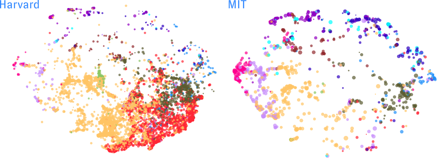
We also took a deeper look at Harvard’s map, finding specific areas of quantum and astrophysics research where the Crimson seem to excel:
All very interesting - but don't Harvard and MIT get enough attention already? In this post, we'll use the same approach to analyze the research leadership of a diverse range of American universities and their contributions to global science and tech. The approach we demonstrate here - using the free, public Map of Science interface - can be used by researchers and administrators to understand their own institutions' portfolios, by funders and policymakers to identify institutions especially relevant to different research topics, and by anyone else needing to understand the activity of different players in science and tech.
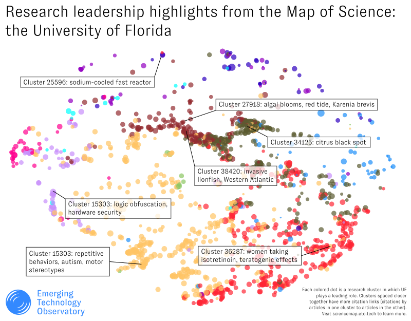
For example, imagine you're affiliated with the University of Florida, and you want to know where your school is currently prominent - maybe to help attract potential students and faculty, to identify where there's room for improvement, or to pinpoint especially promising efforts in research areas where you haven't historically led. Fire up the Map:
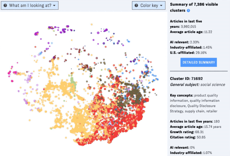
At a glance, we can see that UF is active across a wide range of topics, but with prominent concentrations of activity in the middle of the Map. We can get a feel for what these clusters are “about” by hovering over them, which brings up details and key concepts in the right-hand sidebar:
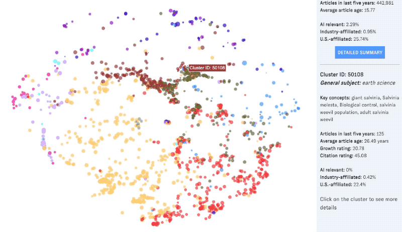
Looks like plenty of research in earth science and biology, with an emphasis on aquatics, tropical topics, and agriculture. These patterns may reflect UF's location, its highly regarded programs in these areas, and its overall size and research strength (it's among the largest schools in the United States).
We can examine individual clusters anywhere in UF's map (using the mouseover previews or cluster detail view) to identify specific areas of research where the university has a strong presence. A few subjectively selected highlights from our own browsing:
For our next example, we'll head north to Pittsburgh, city of rivers, questionable sandwiches, and Carnegie Mellon University, whose research leadership map tracks its top-notch reputation in computer science and related topics:
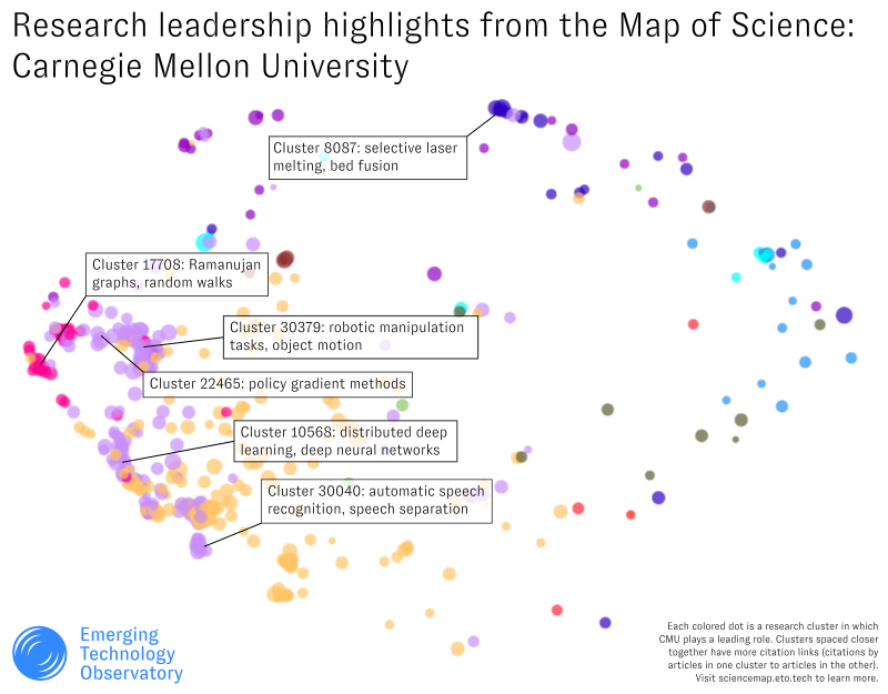
At a glance, we can see that CMU has a strong leading presence in clusters related to computer science - and compared to a much larger school like the University of Florida, CMU's research leadership is more focused in that particular area.
Note that CMU may have less of a leading presence in clusters outside than computer science, but that doesn't necessarily mean CMU isn't active in those areas. This nuance is especially important to keep in mind for universities and institutions that have fewer faculty, less funding, or aren't as focused on publishing research. With smaller research programs, these organizations may not lead in research output in as many clusters as heavy hitters like Harvard, UF or CMU, but again, that doesn't necessarily mean they're not active or producing impactful work in those areas.
All that said, mapping the leadership of these (relatively) less research-active organizations can help show where they specialize or have outsize impact. For example, a short drive from CMU gets you to West Virginia University. WVU is a well-regarded research university, but it lacks the big endowments of CMU or (especially) Harvard, or the huge faculty and student body of the University of Florida. Sure enough, its map looks a little lighter:
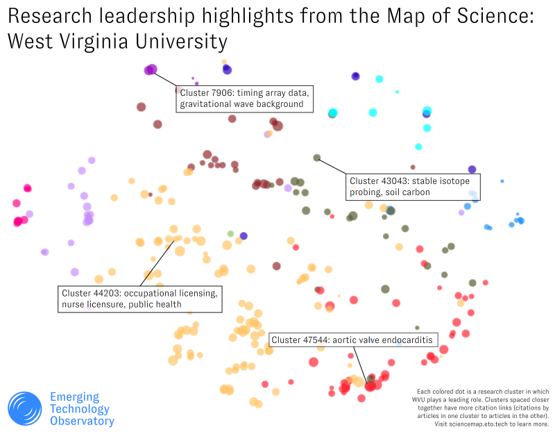
With fewer clusters highlighted, it's harder to visually spot concentrations in WVU's map. You can switch to the Map of Science list view to browse the matching clusters in a table, adding additional sorting columns as helpful. For example, here is a list of the largest research clusters where WVU leads:
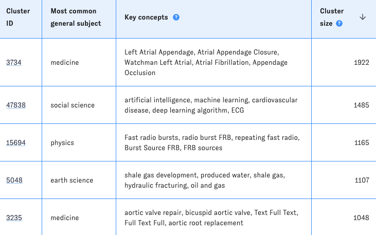
Shale gas fracking tracks with West Virginia's popular reputation - but the Map of Science also highlights that WVU seems to have a strong presence in cardiovascular health and in radio astronomy. (You can open the listed clusters' detail pages to find out more about the specific research they include.) You can imagine how that might be useful information for funders or potential research collaborators interested in those areas, for instance, or for the university itself to map its own strengths and opportunities at a granular level.
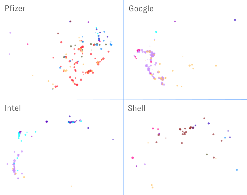
One last note: the Map of Science isn't just for universities! Many different sorts of research-intensive organizations are currently searchable, including major companies and government research institutions. We plan to continue adding new organizations over the course of this year.
In our next post, we’ll show how you can use additional Map of Science filters, views, and sorting options to unlock deeper insight into a specific organization's research, using selected European research institutions as case studies. In the meantime, give the Map a try at sciencemap.eto.tech - or feel free to contact us to learn more. 🤖