Overview
What is this tool?
ETO's Map of Patents organizes and links worldwide intellectual property data, supporting greater understanding of the innovation and commercialization landscape. The Map connects hundreds of millions of patent documents from around the world into over 116,000 clusters based on citation linkage, text similarity, and categorization codes applied by patent examiners. The Map includes data about each cluster's key focus areas, assignees, and inventors, as well as recent growth, grant rate, trendlines, and other indicators.
What can I use it for?
You can use the Map to:
- Track trends in commercialization across industries, as well as emerging technology subjects. The Map's filters can help you find particular areas of interest, ranging from telecommunications to agriculture.
- Identify areas with high recent growth or potential influence, based on various measures of growth and impact.
- Discover leading countries and organizations in different industrial areas.
- Build your own custom Map filters to answer the questions of most interest to you.
What are its most important limitations?
- The Map isn't built for finding individual patents or inventors. Instead, you can look for industries or technology areas using the Map's filters, then browse information about the patents and inventors in those areas.
- The connection between patents in a given cluster may be ambiguous. The Map's clusters are generated algorithmically by connecting patents based on citation links, text similarity, and patent category code similarity. This means patents in a given cluster often share key attributes, such as having the same subject matter or usage, but in some cases, a human subject matter expert might group patents differently.
- The Map shows the patent landscape at a single point in time. The Map's patent clusters come from CSET's Research and Patent Cluster Dataset, which are real-time groupings of patents and do not capture historical change over time through branching, budding, merging, or other large structural changes. Instead, we provide cluster growth statistics based on the first grant date for all patent families with at least one grant in that cluster, with new patents added to existing clusters as they are published.
- Cluster metadata covers the last 10 years, but is generally incomplete for most recent years. Patent authorities take time to publish patents documents they receive, and even longer to make granting decisions. The Map reflects this lag.
- The Map includes patent applications which have not yet been granted (and may not ever be). This means that some of the data in the Map includes work ultimately not considered to be novel inventions by the patent authorities tasked to review them. However, these applications (even ultimately-denied ones) still provide a lens into the kinds of commercial efforts organizations are engaged in, and the inclusion of applications lets us look at work in earlier development than if limited to granted patents.
- The Map does not include unpatented technology or classified patents. Its data sources only include intellectual property that has been protected by patent. We know that some organizations and fields choose to keep their intellectual property in-house rather than patent it, and that classified patents exist; the Map cannot account for this part of the landscape.
- Patent families help us deduplicate work, but they may sometimes be imperfect or incomplete. While our patent metrics are based on EPO's simple patent family, which attempts to aggregate patent documents for the same intellectual property over time and across jurisdictions, new patents may not always be immediately added to relevant families, and families may not always perfectly capture single concepts, especially where an initial idea diverges slightly over the course of a patent application process.
- Some features are missing or limited in mobile. For the full version of the Map, we recommend using a desktop browser.
What are its sources?
The Map of Patents is built using data from the Lens, PATSTAT provided by EPO, and 1790 Analytics. It contains patents from 107 different global patent authorities, including the United States Patent and Trademark Office (USPTO), European Patent Office (EPO), World Intellectual Property Organization (WIPO), China National Intellectual Property Administration (CNIPA), and the Japan Patent Office (JPO).
Does it contain sensitive information, such as personally identifiable information?
No.
What are the terms of use?
The Map of Patents is subject to ETO's general terms of use. If you use the tool in your work, please cite us.
How do I cite it?
Please cite "CSET Map of Patents" and include a link to the tool.
Using the Map
How do I use it?
Viewing the Map
The Map of Patents has three different views:
-
Map view, which is the default for the desktop version.
-
List view, which can be opened by selecting the tab in the top left.
-
Cluster detail view, which can be opened by clicking on a specific cluster in the map view or list view.
Map view
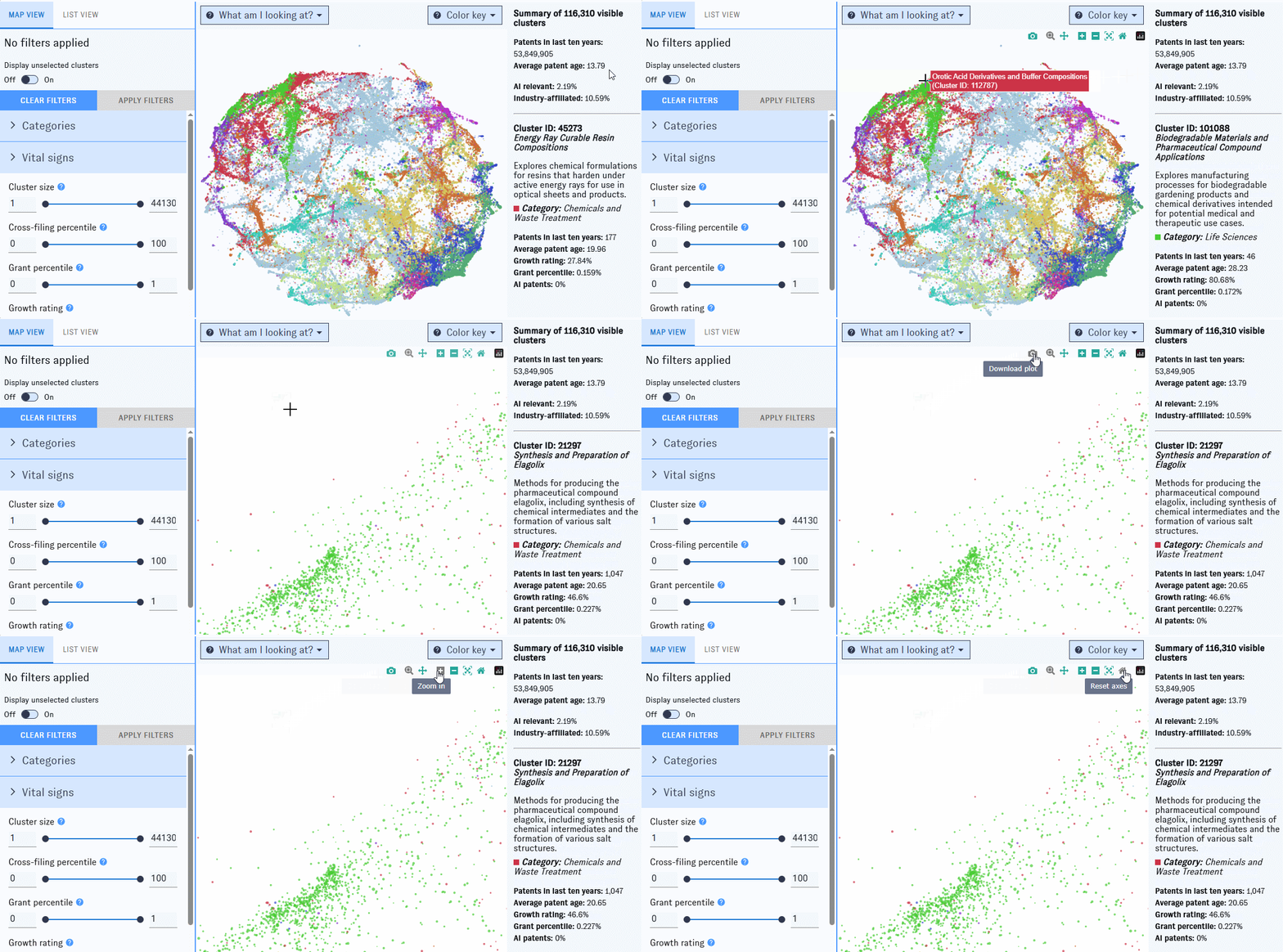
Opening the Map will bring you here first. This view is built around a visualization of over 116,000 patent clusters, each represented by a single dot on the Map. Clusters spaced closer together have more inter-cluster links. The color of each dot indicates the most common industry area (e.g. Life Sciences, Computing, or Manufacturing) among patent families in the cluster from the last ten years; larger dots represent clusters with more patent families added in the past ten years.
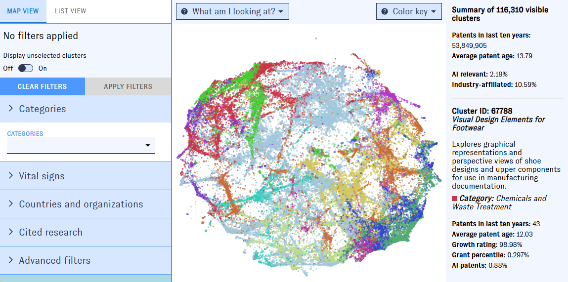
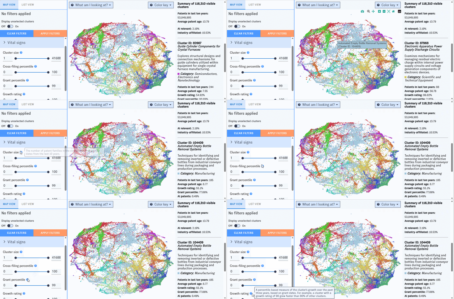
To winnow down the Map, use the left-hand filter menu. Hover over the "?" icons to learn more about what each filter means.
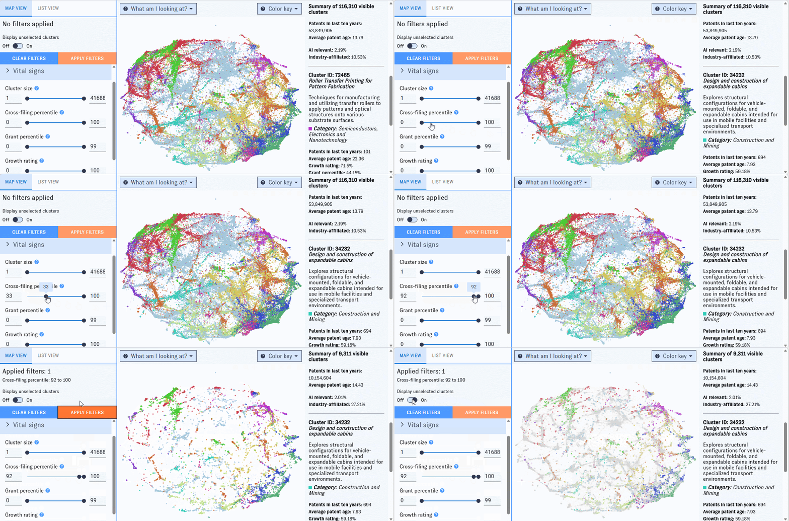
As you work with filters, click the "Apply filters" button to apply them. Clusters that don't match the filters will disappear from the Map, which will automatically rescale around the ones that remain. If you'd prefer to keep all of the clusters visible, use the "Display Unselected" switch.
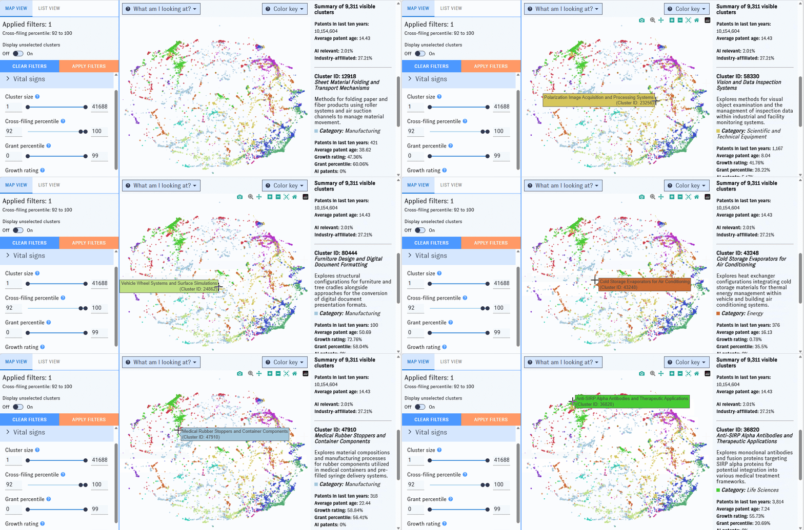
On the right side of the Map, you'll see summary information for all clusters meeting the current set of filters. If you hover over an individual cluster, summary details for that cluster will also appear in the right-hand pane. Click on an individual cluster to bring up its detail view.
Click and drag to zoom in on a portion of the Map. To access more controls, navigate to the top right corner of the window.
List view
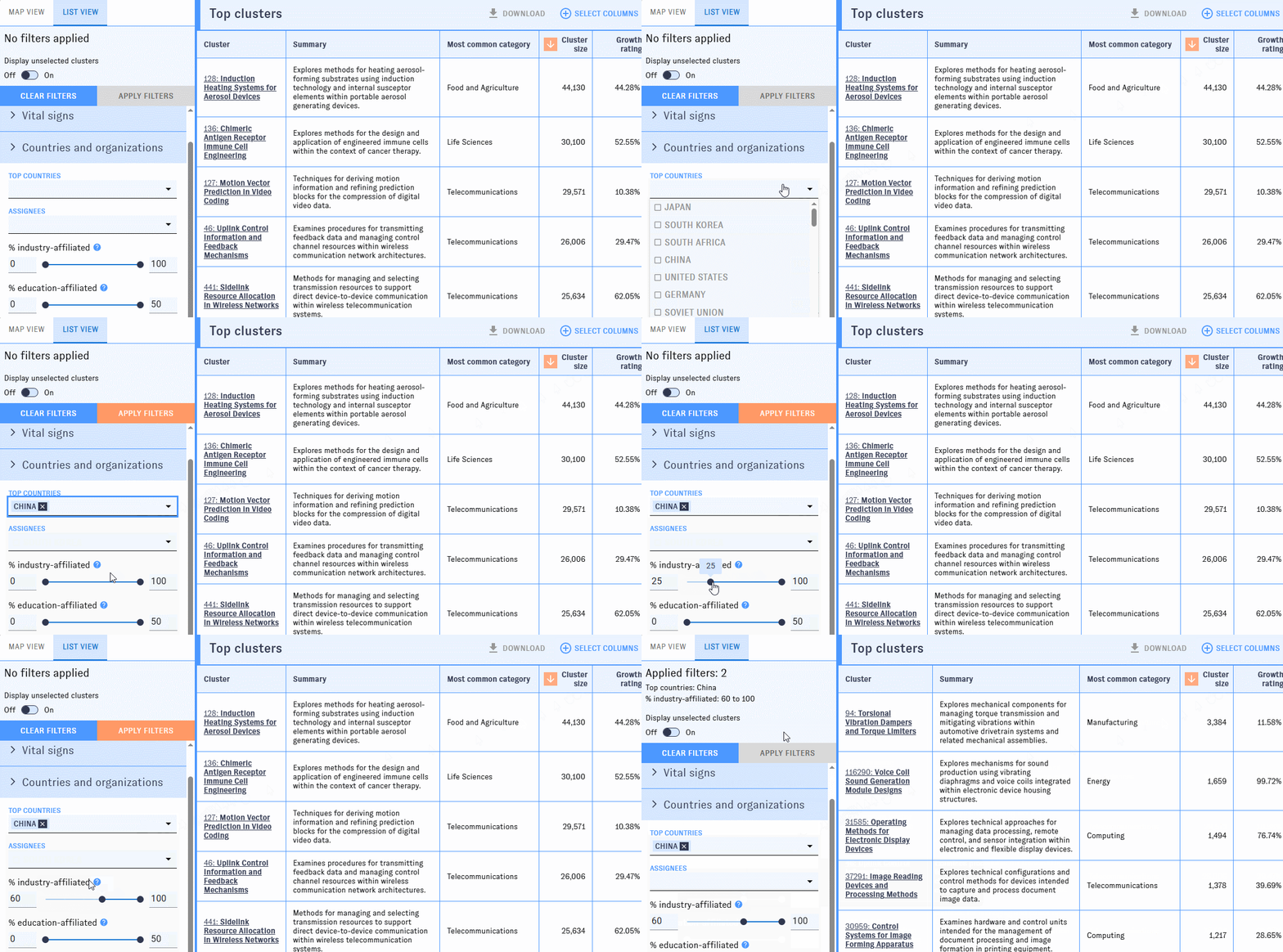
The list view shows each cluster as a row in a table. Use the left-hand filter pane to narrow the table to clusters that meet your filters. To learn more about what the filters mean, hover over the "?" icons.
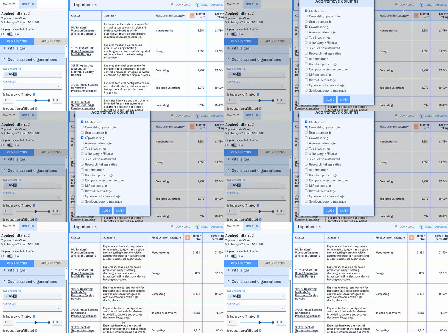
You can add or remove columns with the "Add/Remove Columns" button. Most of the available filters can also be displayed as columns.
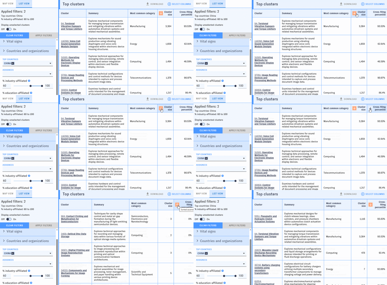
By default, the clusters are listed in descending order by cluster size. You can reorder the table by any column with an arrow icon in ascending or descending order.
Click on a cluster to bring up its detail view.
Cluster detail view
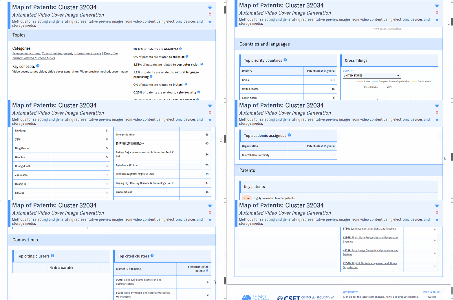
The cluster detail view focuses on the specific cluster you selected, rather than the full Map. It displays fields such as top categories, patents, countries, and assignees, as well as additional cluster-specific data, including a cluster summary, a growth metric, and affiliated inventors.
Exporting data
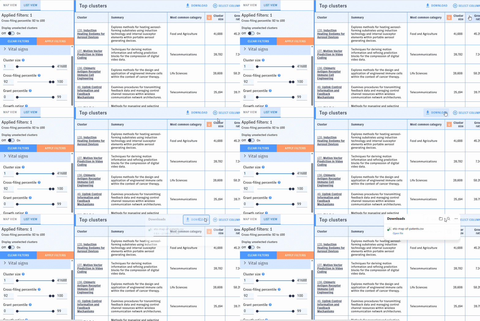
Export is currently available from list view only. After building a query using the Map's filters and customizing your results in list view, just click to download cluster metadata in csv format.
Returning to a specific page
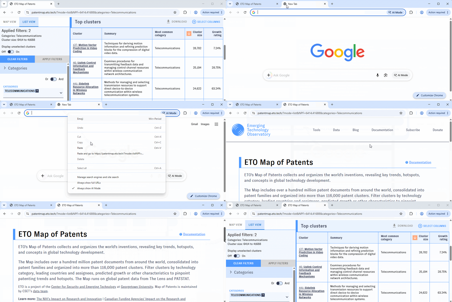
As you use the Map of Patents, your browser's address bar will update to reflect the view and filters you've selected. At any time, copy the URL from the address bar to return to the same page later.
What can I use it for?
Explore patents on any topic, from the general to the very specific. The Map includes filters for a range of industries and emerging technology topics. Tinkering with these filters can lead you to clusters of patents about highly precise work - everything from ephrin receptor targeting in cancer therapy to ferroelectric thin film manufacturing and materials.
Show me patents...
- ...about computing.
- ...about pharmaceuticals.
- ...about telecommunications.
Learn about the key inventors, assignees, and patents in specific industry focus areas using the Map's browse and detail view modes.
- What are some large patent clusters in computer vision?
- What are some patent clusters in medical equipment that South Korea is highly active in?
- Show me areas of patent activity for TSMC or Microsoft in semiconductors.
Identify the research areas with the fastest growth and largest influence based on various measures of growth and impact.
- Which AI-related patent clusters are growing the fastest worldwide? What about in China?
- Which semiconductor clusters have the most cross-filing activity?
- Show me the patents in construction and mining that are 40 or more years old.
Build complex, detailed queries using combinations of filters to quickly zero in on the most relevant topics and actors.
- Show me manufacturing clusters that are large and highly related to robotics.
- What are some key trends in biotechnology patenting where Chinese entities are highly active?
- Show me clusters with strong industry affiliation and high proportions of granted patents.
How have others used it?
The Map of Patents is just being released, so it hasn't received public use yet. However, the patent clusters dataset has been made available internally at CSET, and our researchers have used it to:
- Evaluate the impact of the NIH on the funding landscape and the innovation pipeline, learning more about how funding translates to papers and patents
- Perform similar analysis on the Canadian Tri-Agencies, gaining a better view of the influence of international research funding on eventual research and commercialization outputs.
- Identify patent clusters with a range of AI usage, learning more about how AI techniques are being actively incorporated into mature applications.
We hope that sharing the Map publicly will enable users in academia, industry, and government to consult the Map in decisions related to research planning, science and technology policy, national security, and other domains.
Which uses are not recommended?
Researching individual people or patents. You can't search the Map for individual people or patents. The Map does include such information in the detail view for each cluster, but only for selected clusters. It is best to first look for particular types of patents or assignee organizations using the Map's filters, then browse information about the people and patents related to that research.
Explaining trends over time in the composition of a specific industry or commercial area. The Map provides a snapshot of the current patent landscape. You can see which clusters have grown fastest over the last five years using the Map's growth filter, but you can't see how an area has evolved over time in terms of its participants or categories. You can learn about such trends using careful combinations of filters and manual examination of cluster details, but the Map isn't currently designed to support such analysis.
Studying technologies unlikely to show up in public patents, such as classified government research or certain trade secrets and commercially sensitive R&D. The Map relies entirely on what organizations choose to patent, and the tradeoff between being able to legally protect intellectual property and choosing to potentially reveal sensitive information to rival organizations is one that different organizations balance differently.
Drawing definitive conclusions about recent trends. Due to the delay in the release of documents by worldwide patent authorities, and the even longer delay in granting patents, the Map's cluster metadata have a significant lag. Be cautious when interpreting metadata from the last few years.
Sources and methodology
All of the data used to generate the Map of Patents comes directly from the Research and Patent Cluster Dataset. The Research and Patent Cluster Dataset uses data from the Lens, PATSTAT, and 1790 Analytics to create over 116,000 clusters of patent families based on inter-patent citations, title and abstract text similarity, and the similarity between the text of patent category codes assigned by patent examiners (CPCs and IPCs), and generates extensive metadata about each one, including cluster growth, industry area, and other topics. All of the visualization, filtering, and other features in the Map of Patents use this cluster-level metadata. To learn more about a particular Map of Patents feature or filter, refer to the cluster metrics and metadata section below.
Clusters based on citations, text similarity of the patents, and text similarity of the patent codes often represent sub-industries, shared application areas, or other real-world concepts. For example, our clustering process can automatically identify and isolate areas related to concepts like water permeability testing for submarine cables, computational methods for protein structure prediction, or hydrogen storage and refueling station infrastructure.
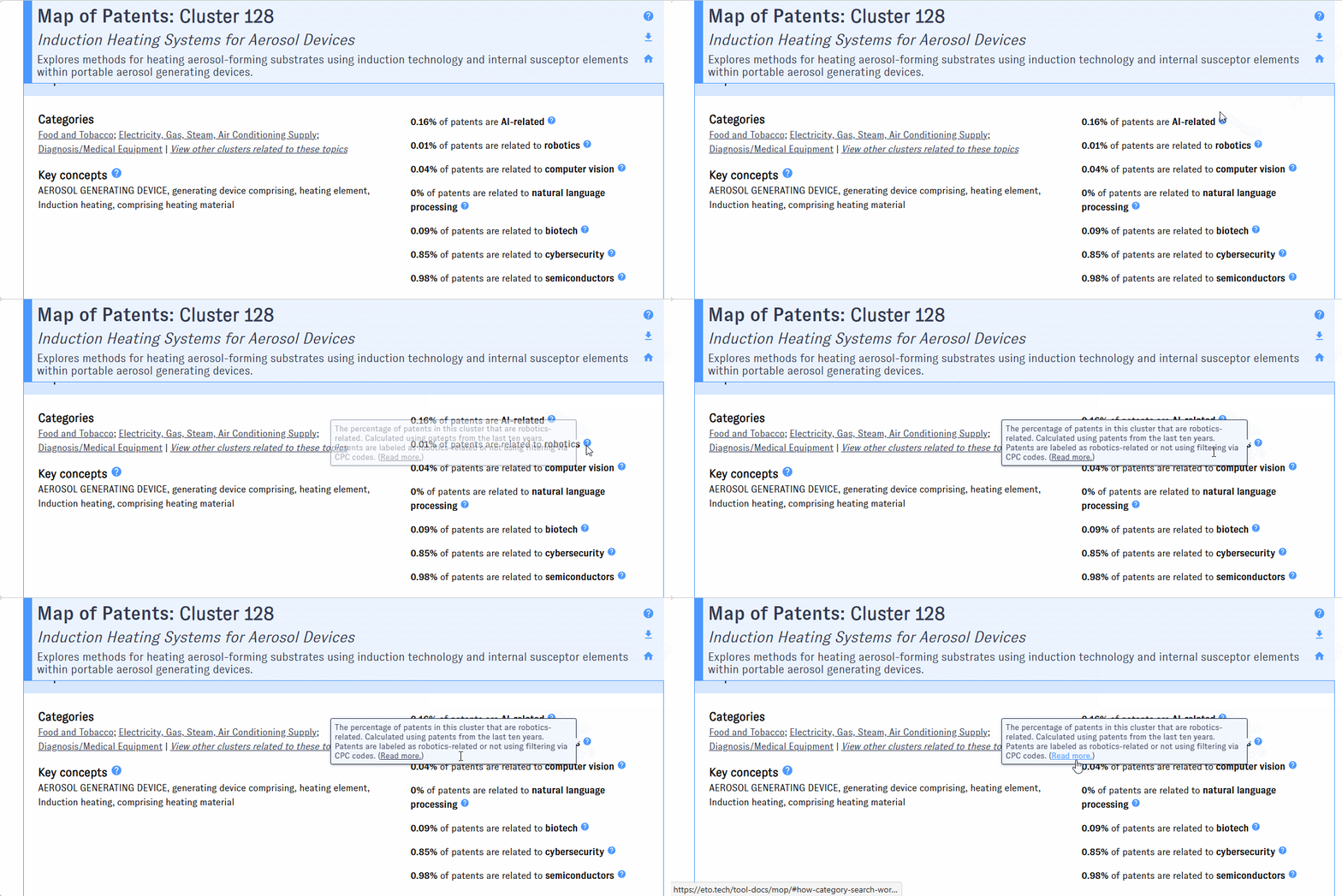
Look for tooltips throughout the Map's interface for details on how these data sources are being used.
How category search works
As you type into the Map's "Categories" field, you'll be prompted with options identified as "broad categories," "categories," "fields," and "subfields."
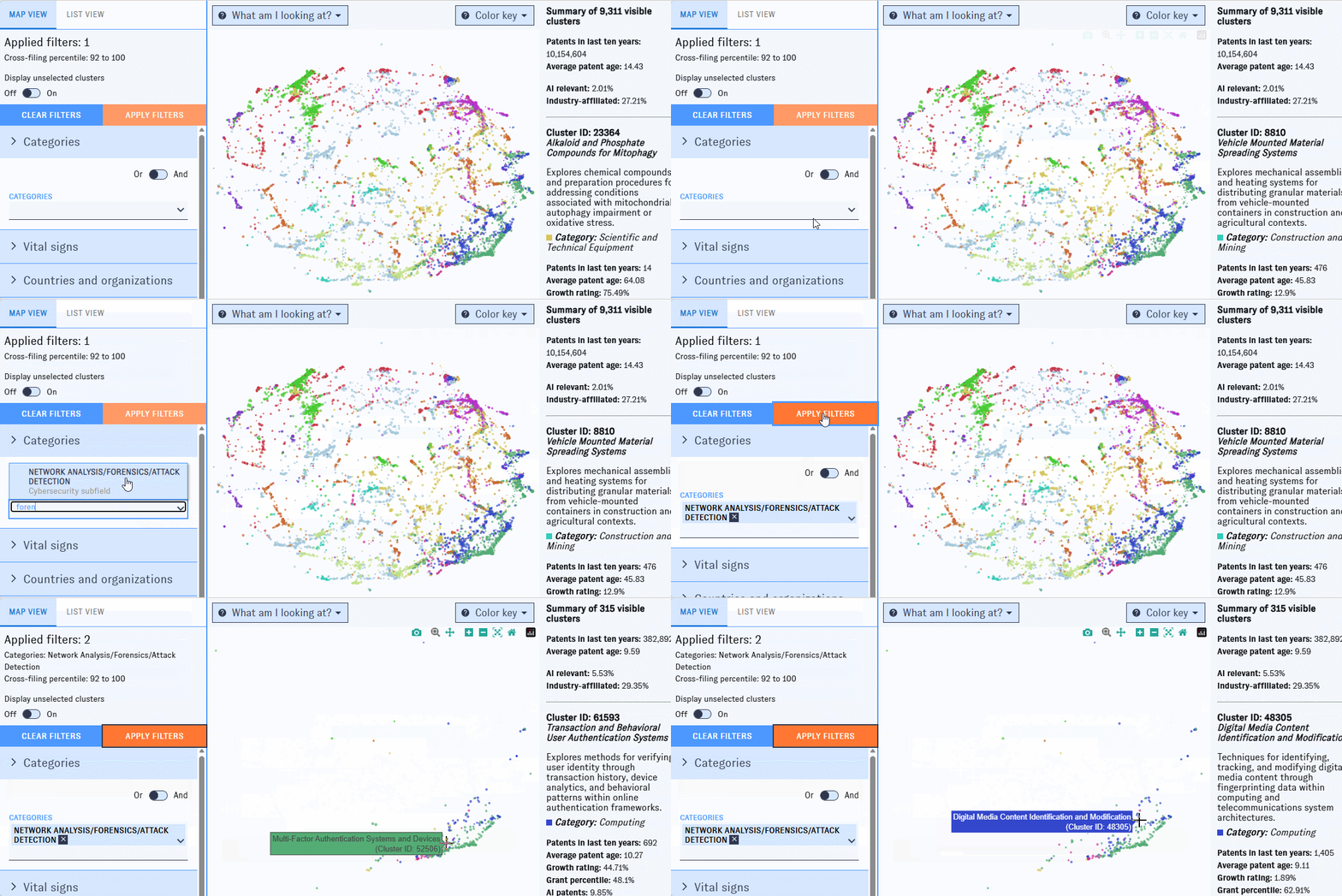
Selecting options from this menu will return clusters containing high proportions of relevant patents. For example, picking "life sciences" returns clusters with lots of life science patents in them.
Each of these options works through the same basic mechanism, with some minor differences.
- Broad categories and categories are derived entirely using the CPCs and IPCs on patents, with subject matter expert review supported by 1790 Analytics to assign the codes in question to categories and a taxonomy selected by following the ISIC standard for industry classification. All patent families are assigned exactly one broad category and one category, although we also internally store their proportion of each category. We include the top one broad category and top three categories for each cluster.
- Fields and subfields are based on emerging technology areas, and are derived using a similar method based on CPCs and IPCs, but sometimes supplemented by keyword search in cases where an area is emerging and sufficient codes are not yet available. Patents can have a single field, multiple fields, or no fields; they will only have subfields of that field if they have at least some relationship to the top-level field. The percentage of patent families in the cluster that are assigned to an individual field or subfield is available for each cluster, and filtering by any of them will return all clusters where 10% or more of the patents in the cluster are assigned to the corresponding field or subfield. For example, filtering to computer vision clusters returns clusters with 10% or more computer vision patents. (Pro tip: If you want to experiment with different percentage thresholds, each primary emerging technology field has a corresponding customizable filter under the "Advanced filters" pane in the filter menu.)
Each field's subfields were developed using a different taxonomy associated with the emerging area:
- AI subfields were derived from the ACM Computing Classification System AI and machine learning categories.
- Robotic subfields are based on the IEEE Robots taxonomy.
- Finally, Cybersecurity subfields and Biotechnology subfields were developed using custom taxonomies created jointly by CSET and 1790 Analytics.
Cluster metrics and metadata
The Map's filters, list-view columns, and summary and cluster detail views draw on the following cluster-level metrics and metadata, calculated from the patents in each cluster.
Size
- Cluster size is defined as the number of patent families in the cluster whose first priority document was submitted in the past 10 years.
Average patent age
- The average age of patent families in the cluster (age = current year - year of first priority document submission for the patent family).
Cross-filing percentile
- A cluster's cross-filing percentile is equal to the percentage of patent families in the cluster that have had patents filed in multiple different jurisdictions (i.e. multiple countries, typically), normalized over the full set of clusters to arrive at a percentile.
- Cross-filing increases the expense associated with filing for a patent, and is only generally worthwhile if the inventor believes they have reason to protect their intellectual property in multiple potential markets. It thus tends to be indicative of higher-quality patents more worth protecting, and is a signal that is available at the application stage when many other patent quality metrics require grants, which are released more slowly.
Grant percentile
Cluster grant percentile is equal to the percentage of patent families with priority dates from the last 10 years that contain at least one granted patent document, normalized over the full set of clusters. We exclude the most recent three years of data to avoid penalizing clusters with significant recent work that remains pending with patent authorities.
Growth rating
- A cluster's growth rating is a percentile-based measure reflecting how fast it grew in the past three years relative to other clusters in the dataset. For example, a cluster with a 90th-percentile growth rating grew faster than 90% of other clusters over the past three years. Measuring growth in patents, especially for recent years with limited data, is tricky; for this reason, our growth metric specifically looks for evidence of any strong increases in growth in any of the past 3 years. Unlike most of our other metrics, our growth metrics use first grant date for patent families rather than first priority date, as first priority date won't as closely track recent growth; the tradeoff here is that our growth rating is only based on grants.
Emerging technology subjects
- Our emerging technology subjects include all of our fields and a selected set of our subfields (see categories and fields). Here, instead of having the threshold for inclusion set based on a flat percentage criteria, you can filter clusters based on exactly what percentage of that field you want them to contain, allowing you to see the difference between clusters with 5% AI-relevant patents and those with 30%.
Paper citation statistics
For each cluster, we calculate how often articles are cited by patents in the cluster, compared to other clusters in the Map, and then normalized by industry (that is, broad category): for example, in a 90th percentile cluster, the number of patents that cite articles is higher than in 90% of other clusters in the same industry.
Industry and education affiliation percentage
- For each cluster, we calculate the percentage of patents with at least one assignee from an industry organization, and calculate the same statistics but for educational organizations. We use only patents from the past 10 years in these calculations. It should be noted that even in cases where we have assignees, we often don't have their organization type, so this data may have much more missing information than some other fields.
Key patents
- Each cluster has a list of top patent families from the past 10 years, including each patent's title (of one patent in the family), priority year, number of citations, and reason for inclusion. We also include a Google Patents link to an example patent in the family.
- Patents are included in the list if they qualify as core patents or top-cited patents.
- Core patents: Patents that are especially highly connected to other patents in the cluster.
- To identify these patents, we calculate a "core statistic" for each patent in the cluster, incorporating the patent's age, total number of citations, and how closely linked it is to other patents in the cluster based on the same metrics we use to cluster: citation links, text similarity, and similarity of patent code text.
- Top-cited patents: The patents in the cluster with the most citations.
- Core patents: Patents that are especially highly connected to other patents in the cluster.
Top inventors
- Each cluster has a set of top inventors, including each inventor's name and number of associated patent families in the cluster.
- Top inventors are defined as the inventors with the most patent families in the cluster with priority dates in the past 10 years.
Top assignee organizations
- Each cluster has a set of top assignee organizations, including each organization's name, number of associated patent families in the cluster, and organization type (commercial, education, nonprofit, government).
- Organization type is not always available.
- Top assignee organizations are defined as the organizations associated (through patent assignee relationships) with the most patent families in the cluster published in the past 10 years. For assignees, we select the most recent patent owners first, and fill in with previous owner or applicant information where recent ownership information is unavailable.
Cross-filing statistics
- Each cluster has a set of cross-filing statistics, structured as a list of jurisdiction (generally country) pairs with corresponding patent counts. Each count represents the number of patent families in the cluster with priority dates in the last 10 years that had at least one patent document filed in the associated country in the pair.
Intercluster connections
- We count how strongly each cluster is connected to each other cluster in the dataset using the underlying network between patents. The strength of a connection between two clusters is determined by the number of connections between their respective patents, which is determined based on citations, the similarity of their titles and abstracts, and the similarity between the text of the patent codes.
Map coordinates
- Each cluster has coordinates representing its "location" in a two-dimensional space along with all the other clusters. We use intercluster connections to generate these coordinates; clusters with more connections are typically located closer together. Read more >>
Map coordinates
Each cluster is assigned coordinates in a 2D space containing every other cluster in the dataset, with clusters that are more closely linked more often positioned closer together. These coordinates are approximations. Technically, the "location" of a cluster has thousands of dimensions - one for each cluster in the map, where each new dimension is mathematically needed to accurately represent a cluster's "distance" (or degree of connection) from the other clusters. That means the distances between clusters can't be perfectly represented in two-dimensional space; 2D visualizations like the Map of Patents can only approximate these distances.
To generate 2D coordinates for the clusters, we create a graph from the intercluster connections for every cluster in the dataset, then process the graph with the DRL algorithm (implemented in igraph), generating several candidate 2D layouts. Across these layouts, clusters that share more intercluster connections are generally closer together, but the layouts differ due to random variation in the algorithm. We identify the candidate layout with the least overall difference from all the others. Finally, we extract coordinates for each individual cluster from the layout.
Top citing and cited clusters
- For each cluster, we use inter-cluster citation counts to identify the other clusters that most often cite and are cited by the patents in the cluster.
Maintenance
How is it updated?
The Map interface is updated intermittently as new features are developed. The underlying cluster structure and metadata are updated roughly monthly; see the Research and Patent Cluster Dataset documentation for more details.
How can I report an issue?
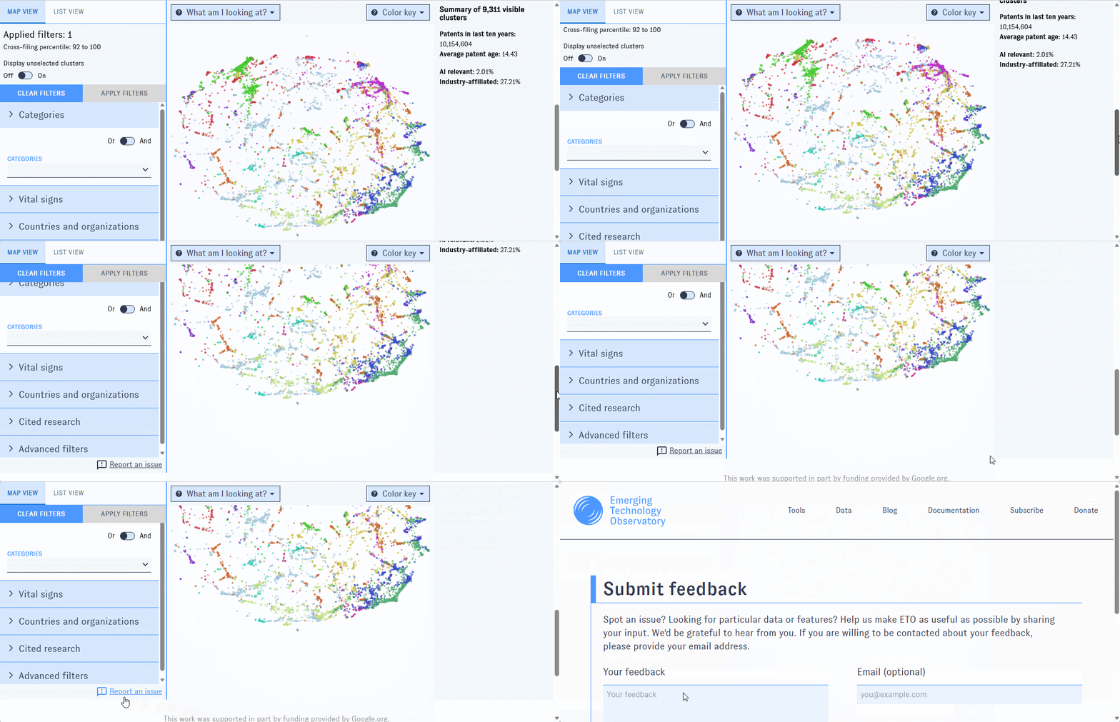
Use our general issue reporting form, or click on the "Submit feedback" icons embedded in the tool to report issues related to specific data points.
Credits
Major change log
| 07/28/26 | Initial release |