
🔔 Attention Substack users! ETO blog posts are also available on Substack.
Over the last few posts, we've used the Map of Science's new author organization filter to explore the research leadership of some notable American schools and their European counterparts. Today, we'll wrap up the series with a look at some of China's leading universities. As in the previous posts, the approach we demonstrate here - using the free, public Map of Science interface - can be used by researchers and administrators to understand their own institutions' portfolios, by funders and policymakers to identify institutions especially relevant to different research topics, and by anyone else needing to understand the activity of different players in science and tech.
The Map of Science includes millions of articles by authors from Chinese institutions, with especially thorough coverage of Chinese research that's published in international journals or otherwise has English-language metadata. As with the U.S. and Europe, you can use the Map to visualize where different Chinese schools, companies, and government organizations lead across different areas of science and tech research.
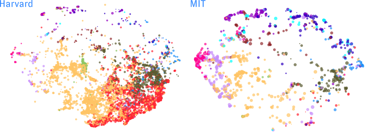
For example, in our first post in this series, we compared Harvard and MIT's research leadership maps:
We can easily run the same comparison between the "Harvard of China," historic Peking University, and the "MIT of China," engineering powerhouse Tsinghua University:
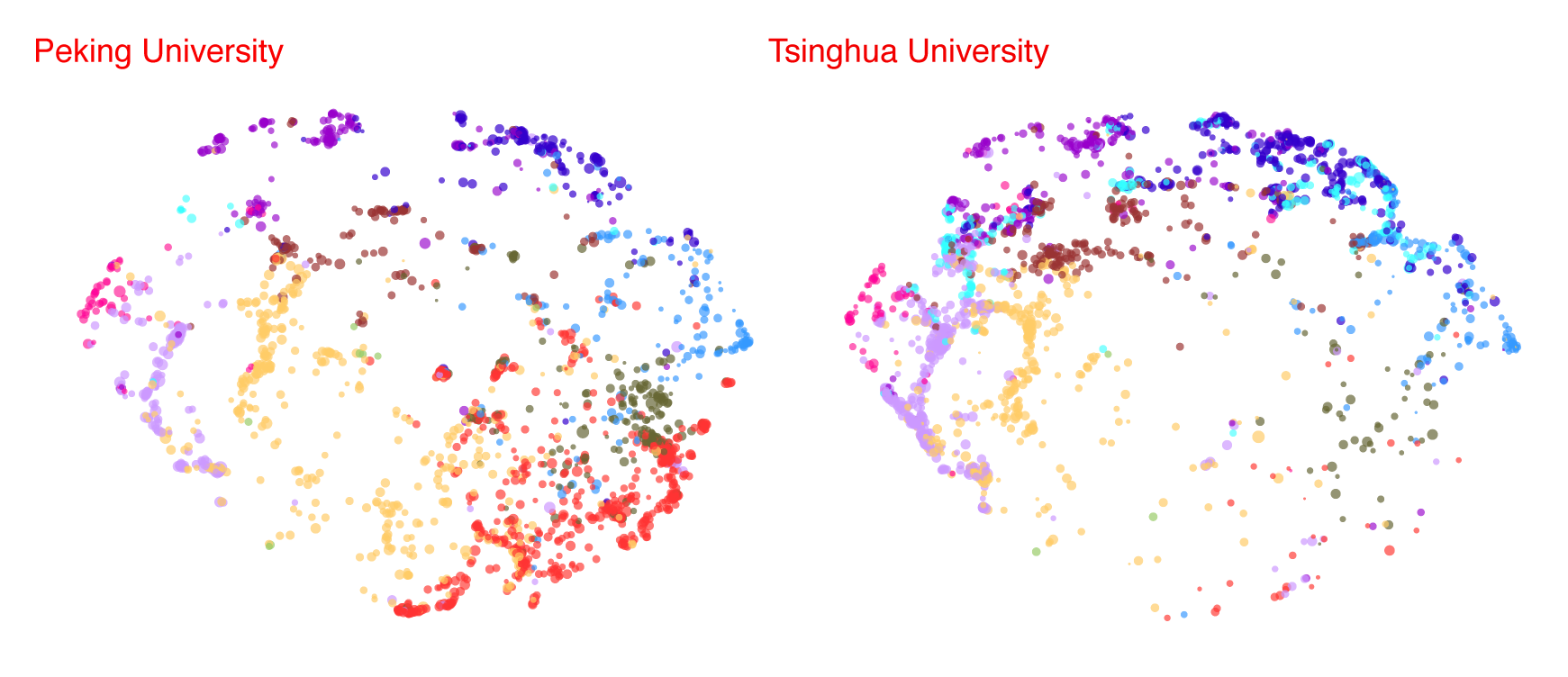
At a glance, we can see that their research tracks their nicknames - Peking's map looks more similar to Harvard's, with its broad distribution of clusters across different topic areas (represented by different colors) and a strong showing in medicine (red), while Tsinghua's map looks more like MIT's, with higher density in the "edges" corresponding to fields like computer science (lavender), physics (purple), earth sciences (brown), materials science (dark blue) and chemistry (light blue).
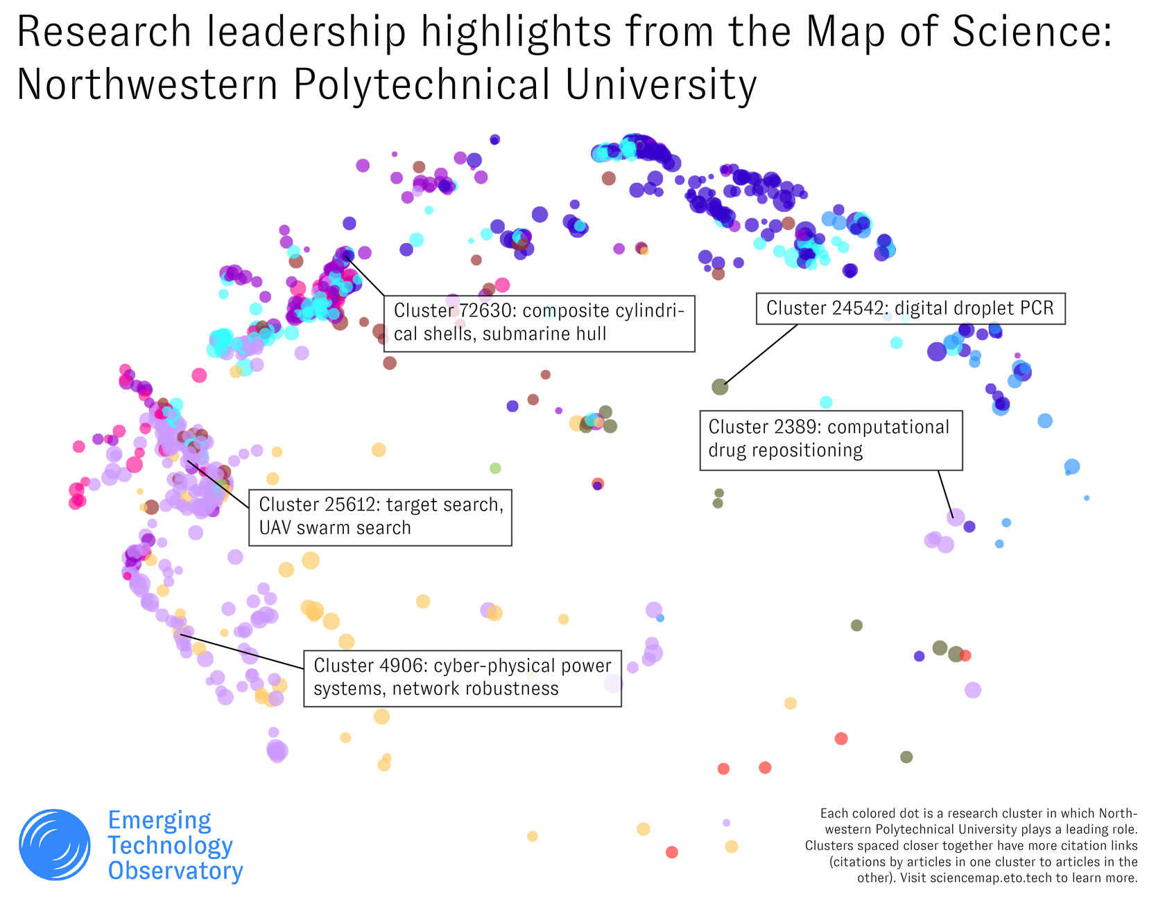
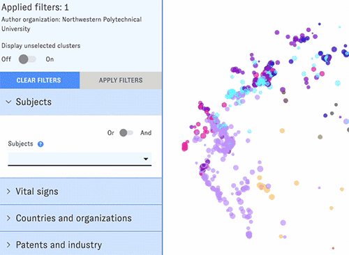
The Map of Science includes data on a wide range of research institutions - not just the Harvards and Tsinghuas of the world. For example, below is a snapshot of the research leadership map for Northwestern Polytechnical University, a lesser-known university that has attracted some attention for its ties to China's government and military. You can examine individual clusters in NPU's map (using the mouseover previews or cluster detail view) to identify specific areas of research where the university has a strong presence. A few subjectively selected highlights from our browsing:
The Map's research organization filter combines easily with others for more complex queries. For example, we can add on the Map's subject filter to focus on NPU's areas of research leadership that are relevant to robotics in particular:
Switching from the default map view to tabular list view allows for quicker "skimming" of the search results. You can also add new columns to the list view and sort the resulting table by different metrics.
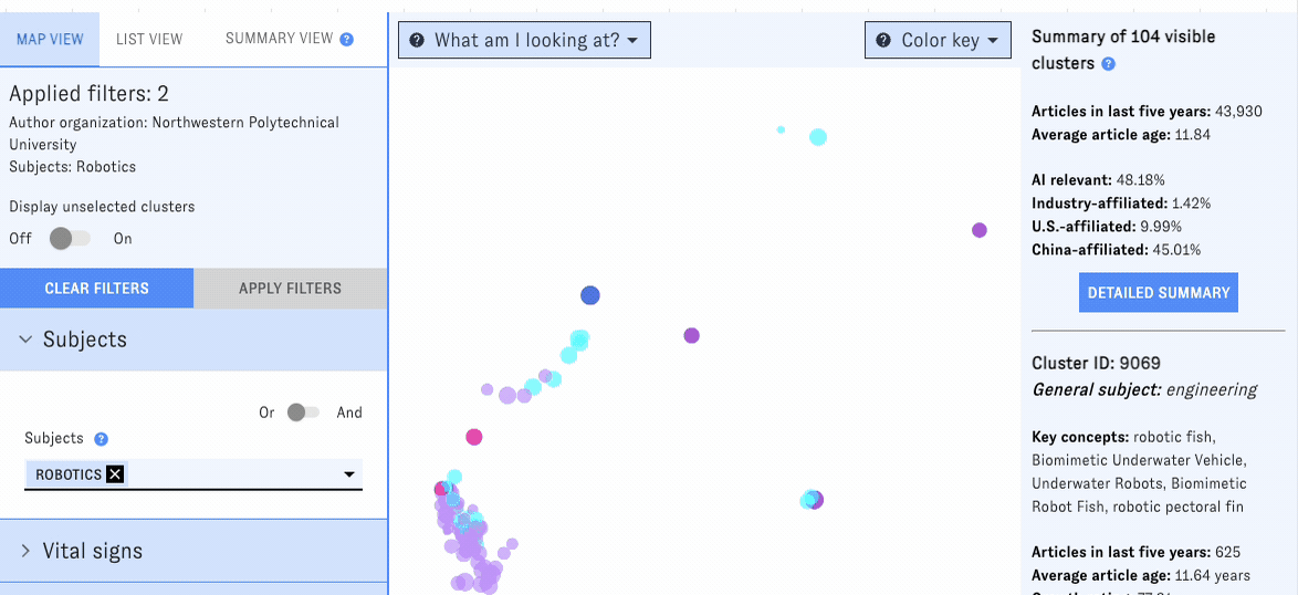
According to the Map of Science, NPU leads in about 100 robotics-related research clusters. (Note that it may be active in other robotics clusters - these are the clusters where it breaks the top ten research organizations.) Below, we've compiled some of our favorites after a skim.
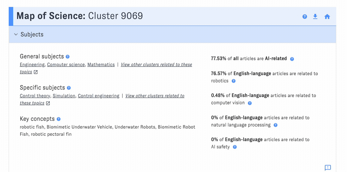
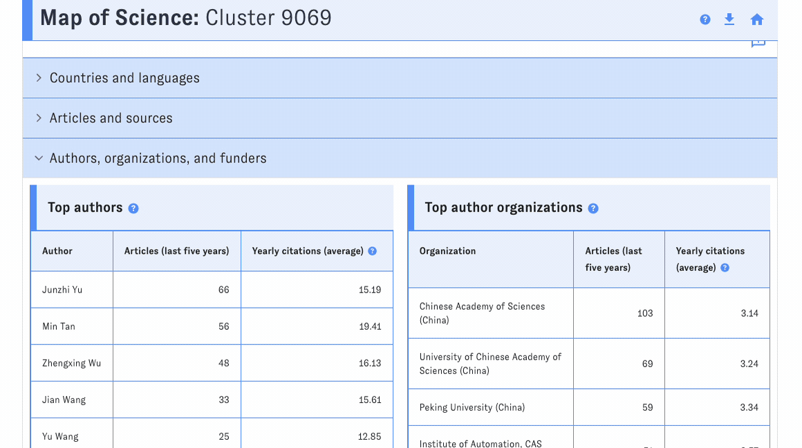
Our top pick from this list, unsurprisingly, is the 🐠 robot fish 🐟 cluster (#9069), one of the faster-growing clusters in the Map (77th percentile). From browsing the cluster's detail view, we can see that NPU authors have published 27 articles in this area in the last five years. Other leading Chinese institutions, such as the Chinese Academy of Sciences and Peking University, are even more active here - as is the Polish Naval Academy, interestingly enough.
If you wanted to dive deeper 🤿 into the world of robotic fish, you could use the detail view's article list to access key articles, or view deeper metadata in an external source like Web of Science.
To explore how other Chinese universities are pushing forward in science and tech, give the Map a try at sciencemap.eto.tech - or feel free to contact us to learn more. 🤖